Product design language giving points of differentiation

Sindoh had established itself as South Korea’s market leader in the production of copiers and office equipment when we were challenged to help them leap from being an OEM supplier to becoming a brand with global ambitions.
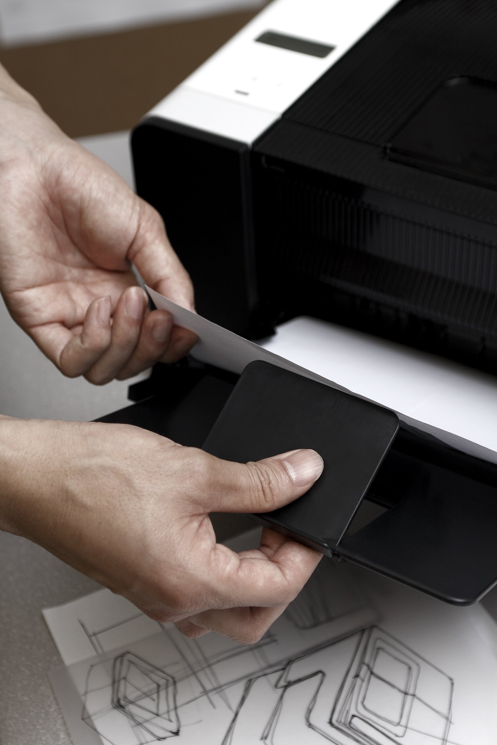
Their R&D engineers, who we expert in the design and manufacture of every part of a printer, scanner and copier, had innovated to create an ingenious way of allowing A4 photocopiers to produce A3 print-outs. Critically, the CEO had decided that the time was right to become a serious player under its own name.
Whilst they were eager to reach out to the global market with an innovative new range of products, they needed a strong product design identity that could stamp a unique positioning for them in the market.
Services
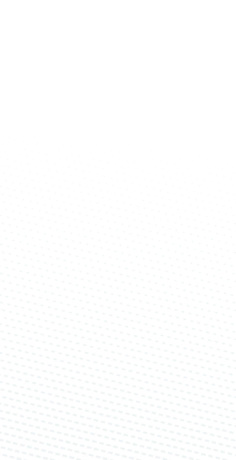
- Market & User Research
- Product Design
- Design Engineering
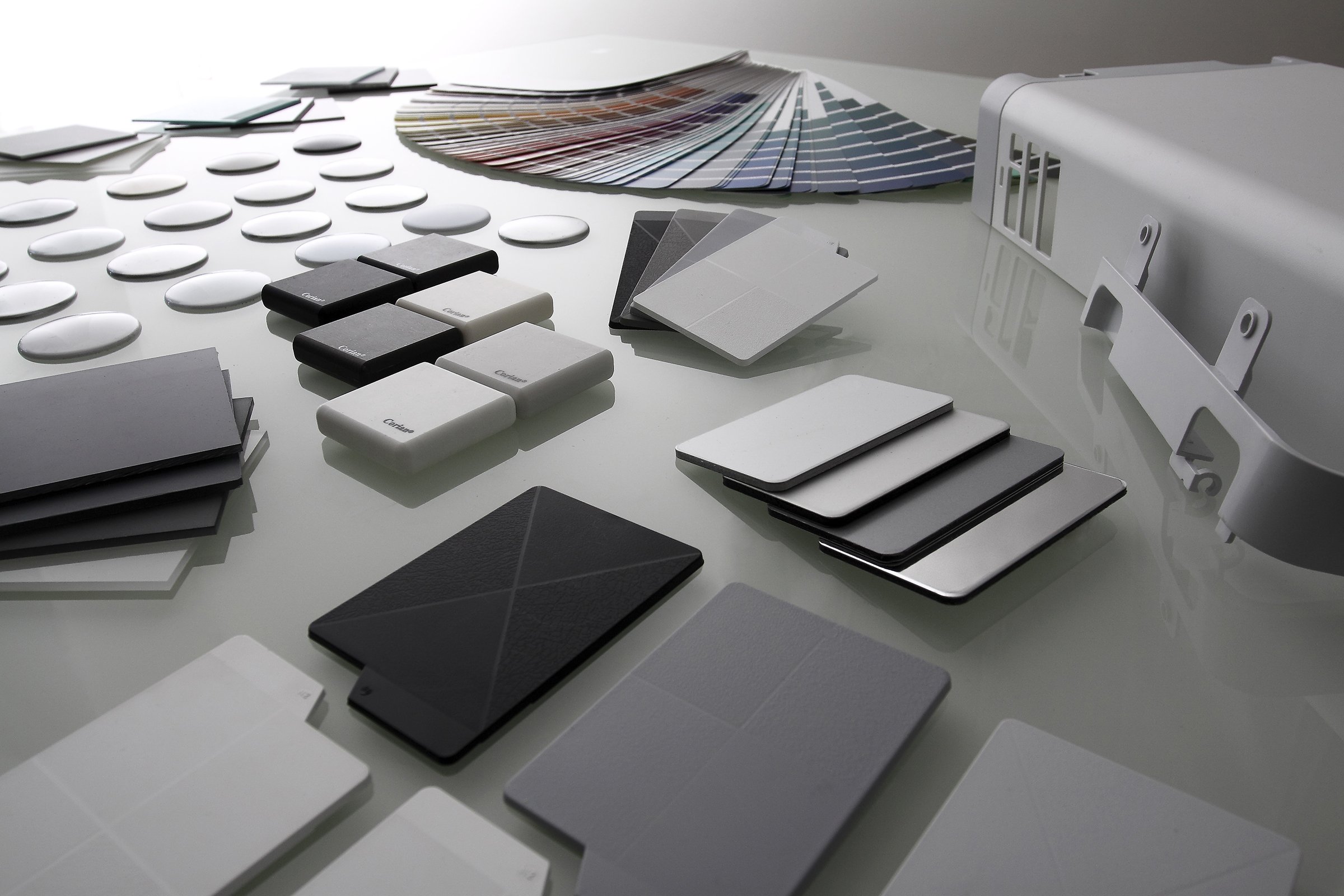
- Colour, Material & Finish
- User Experience & UI
Learning
Sindoh’s CEO is passionate about modern architecture and a avid collector of modern art. He wanted his product range to not only offer strong technical and user benefits, but to also have a clear and distinctive user experience and look and feel.
Rising to the challenge, we undertook an intensive exercise of ‘looking in’ to define product attributes and values and define the overall character of Sindoh-ness, and the unique and ownable features it would own. In tandem, we ‘looked out’ at the printer market and the positioning of competitors to define the gap that Sindoh could take up.
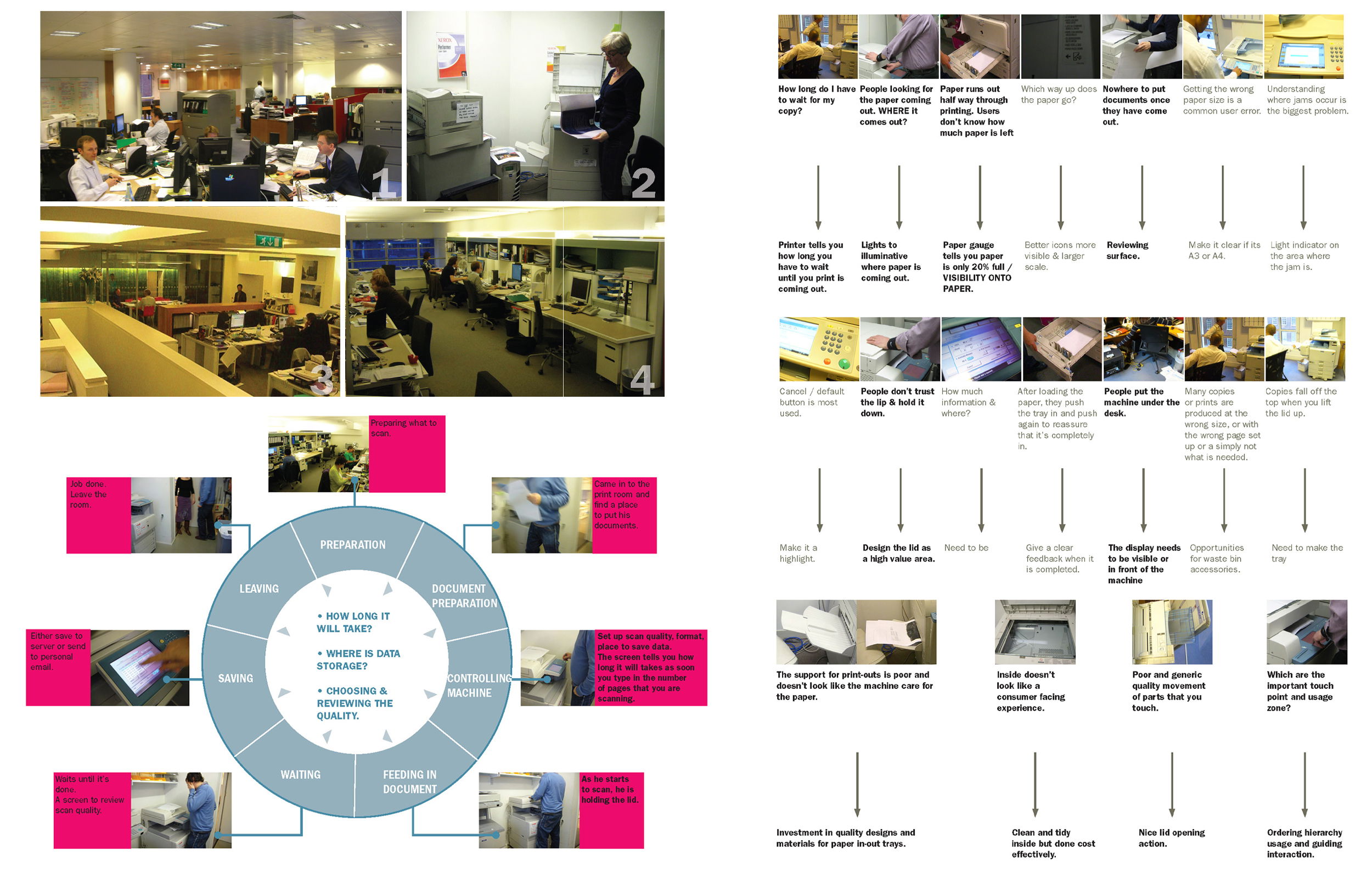
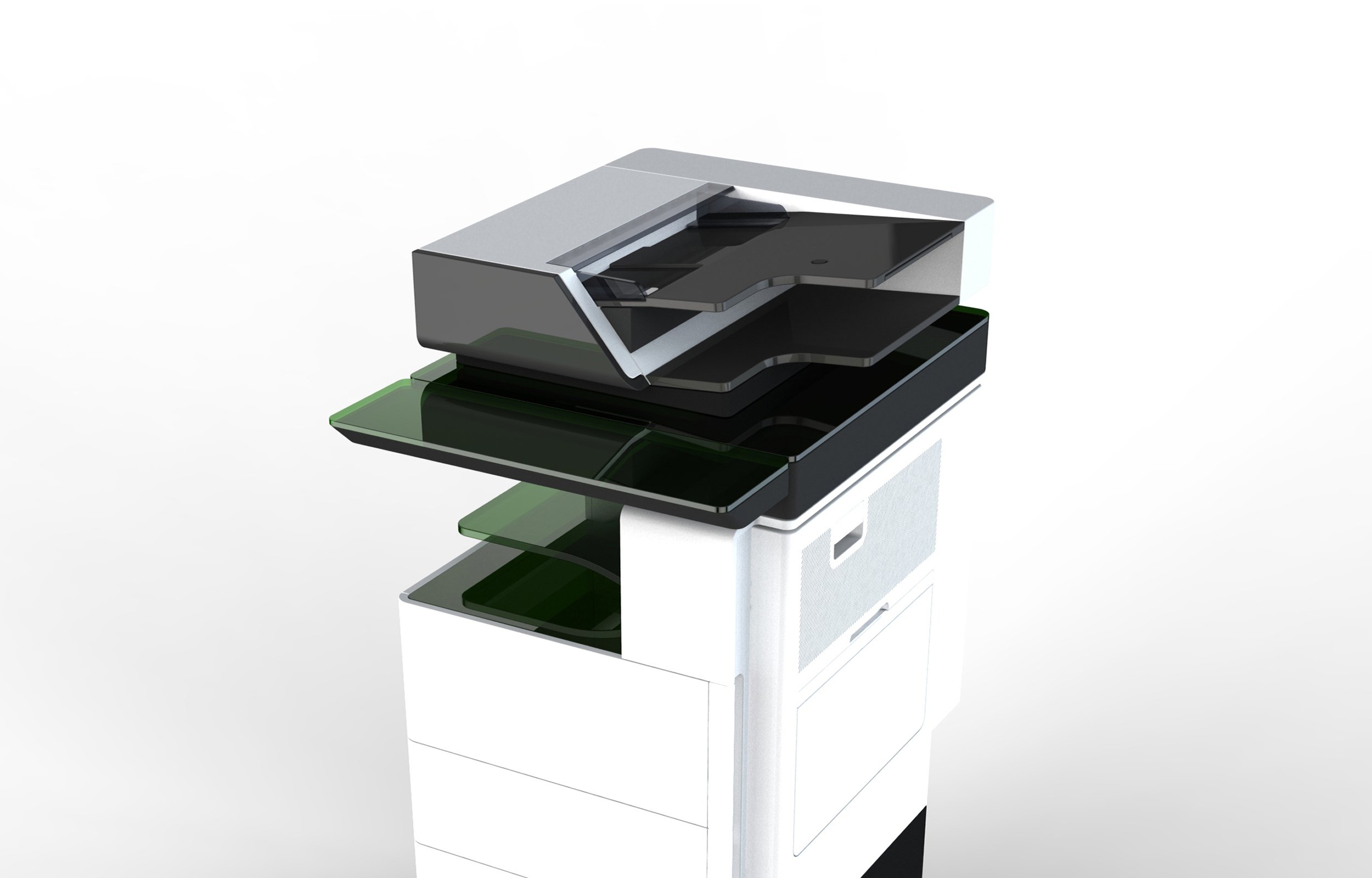
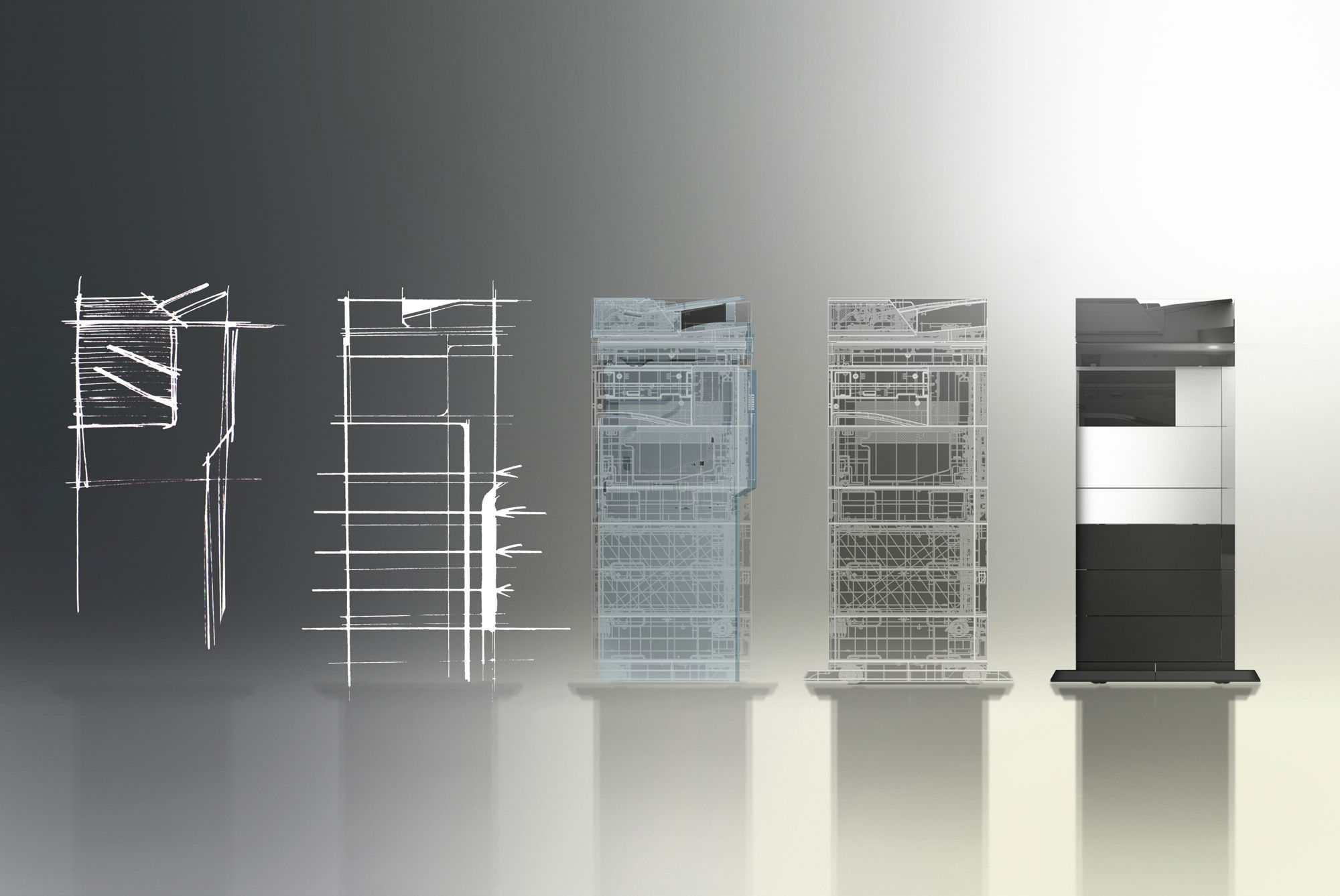
We became convinced that a marriage of form and function could become a defining point of the new product visual identity. And began to establish a design DNA that had a sculptural quality and yet put clarity of use at its heart.
Leaping
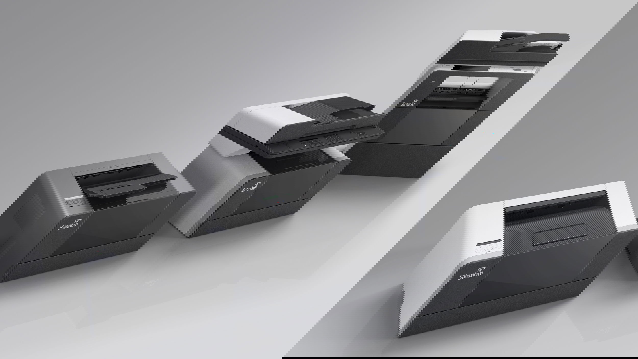
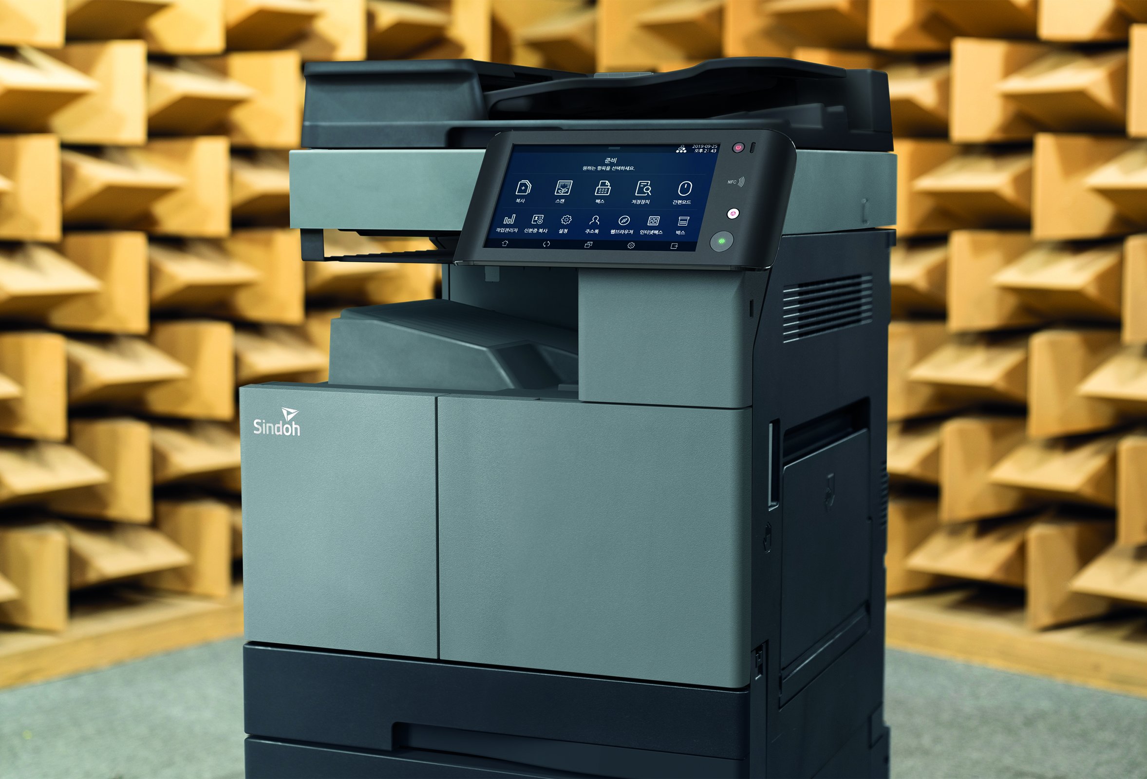
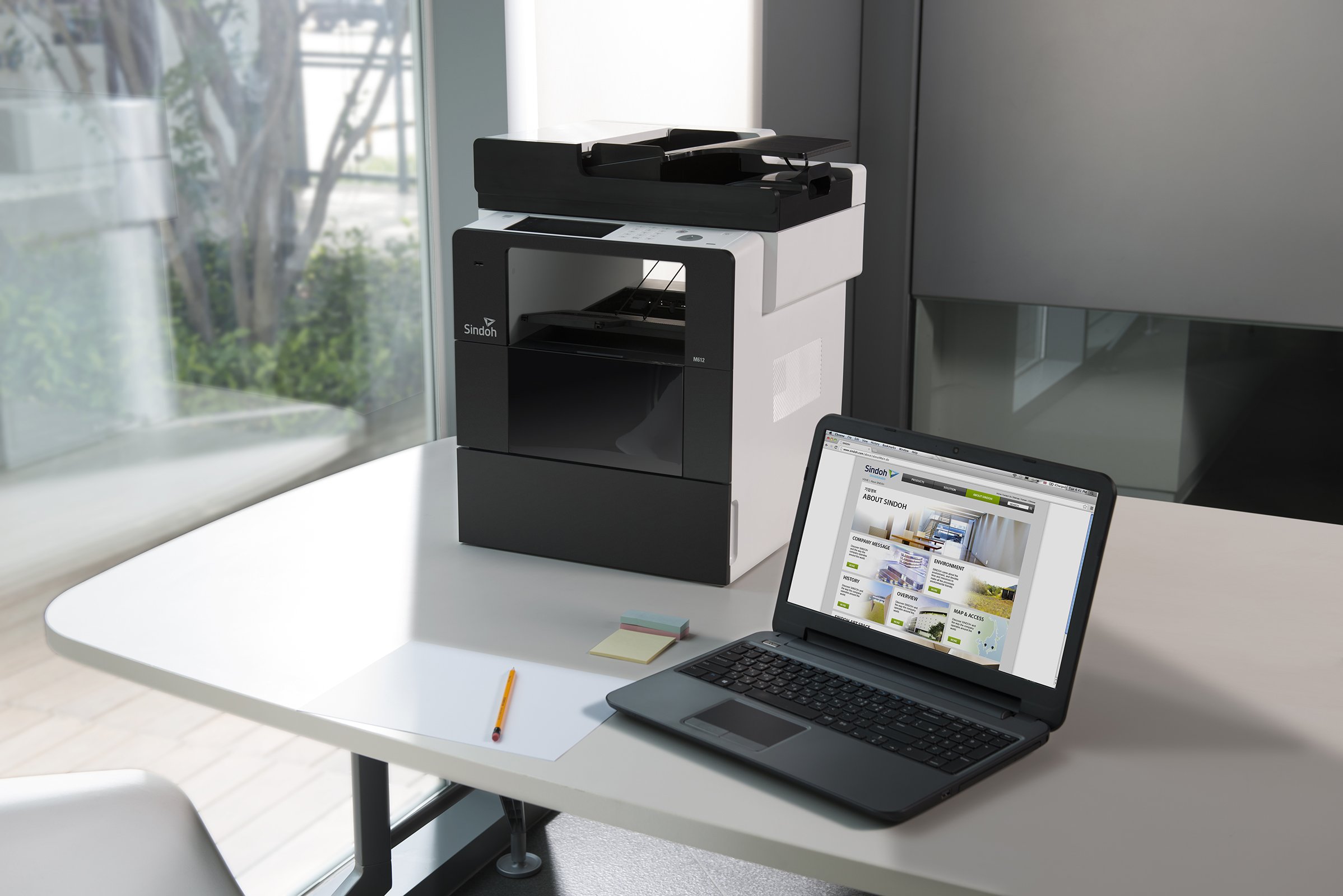
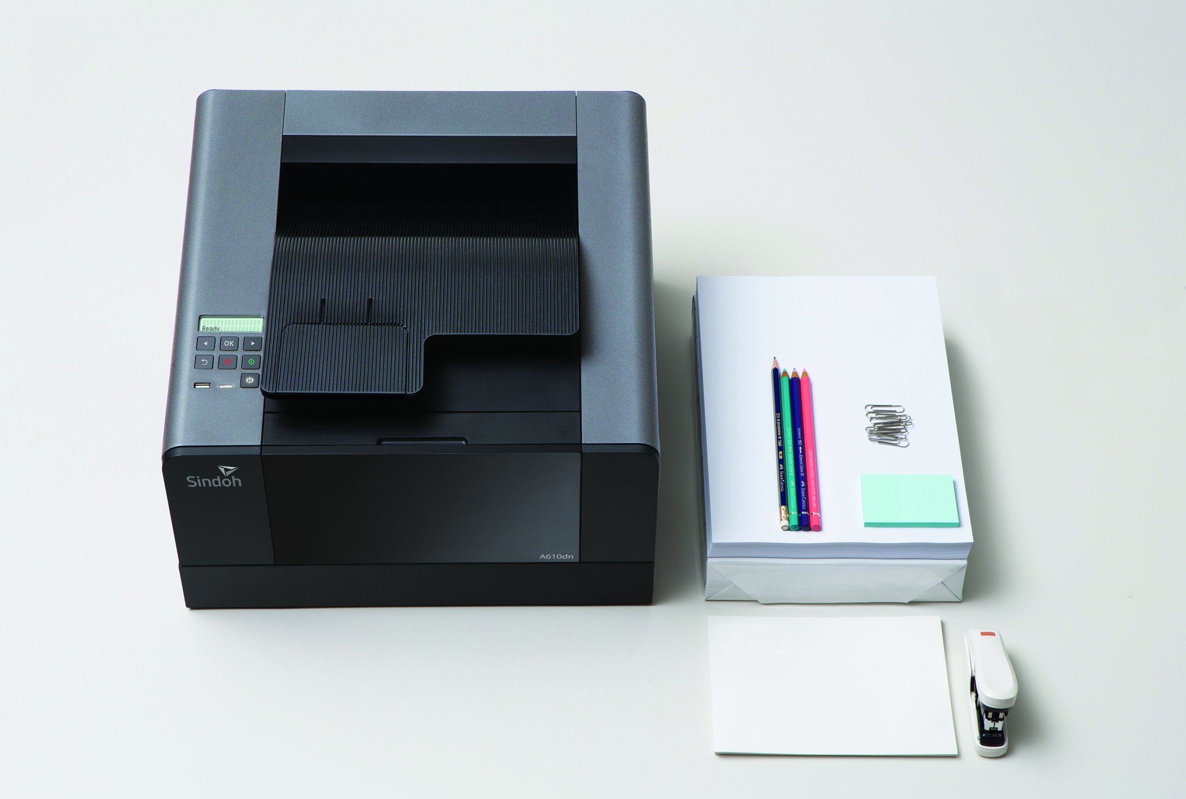
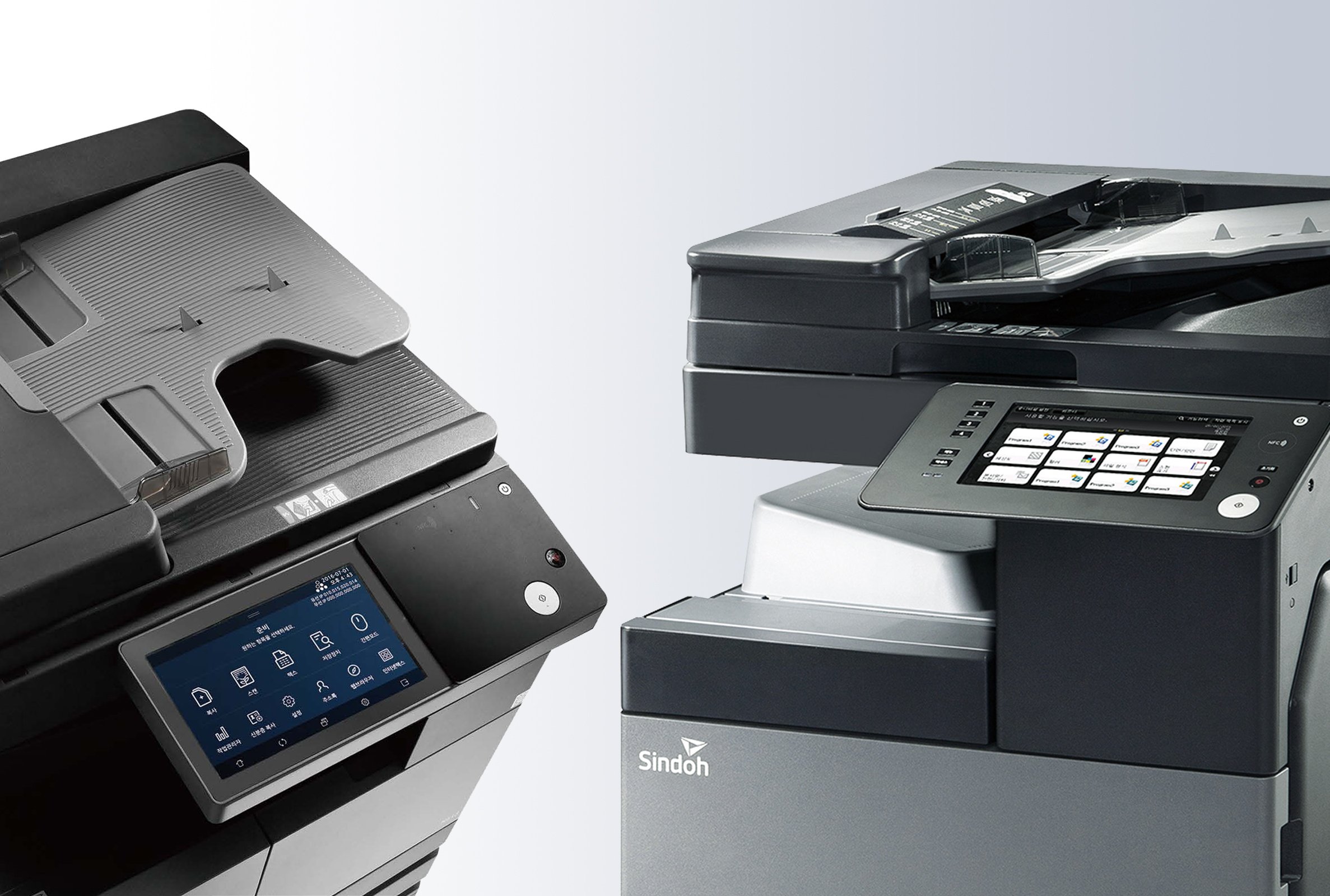
We created a distinctive and differentiated visual DNA for Sindoh’s first range of own-branded printers. Dynamic shapes and clean lines bought a fresh approach to colour through the use of monochromatic panelling and contrasting treatments of materials and surfaces.
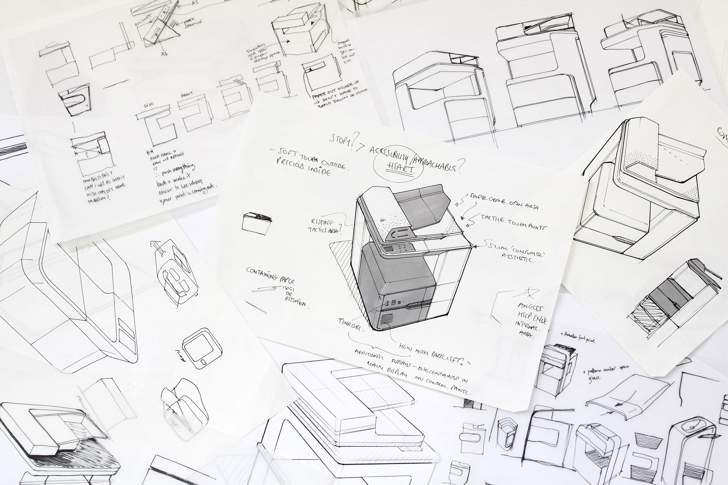
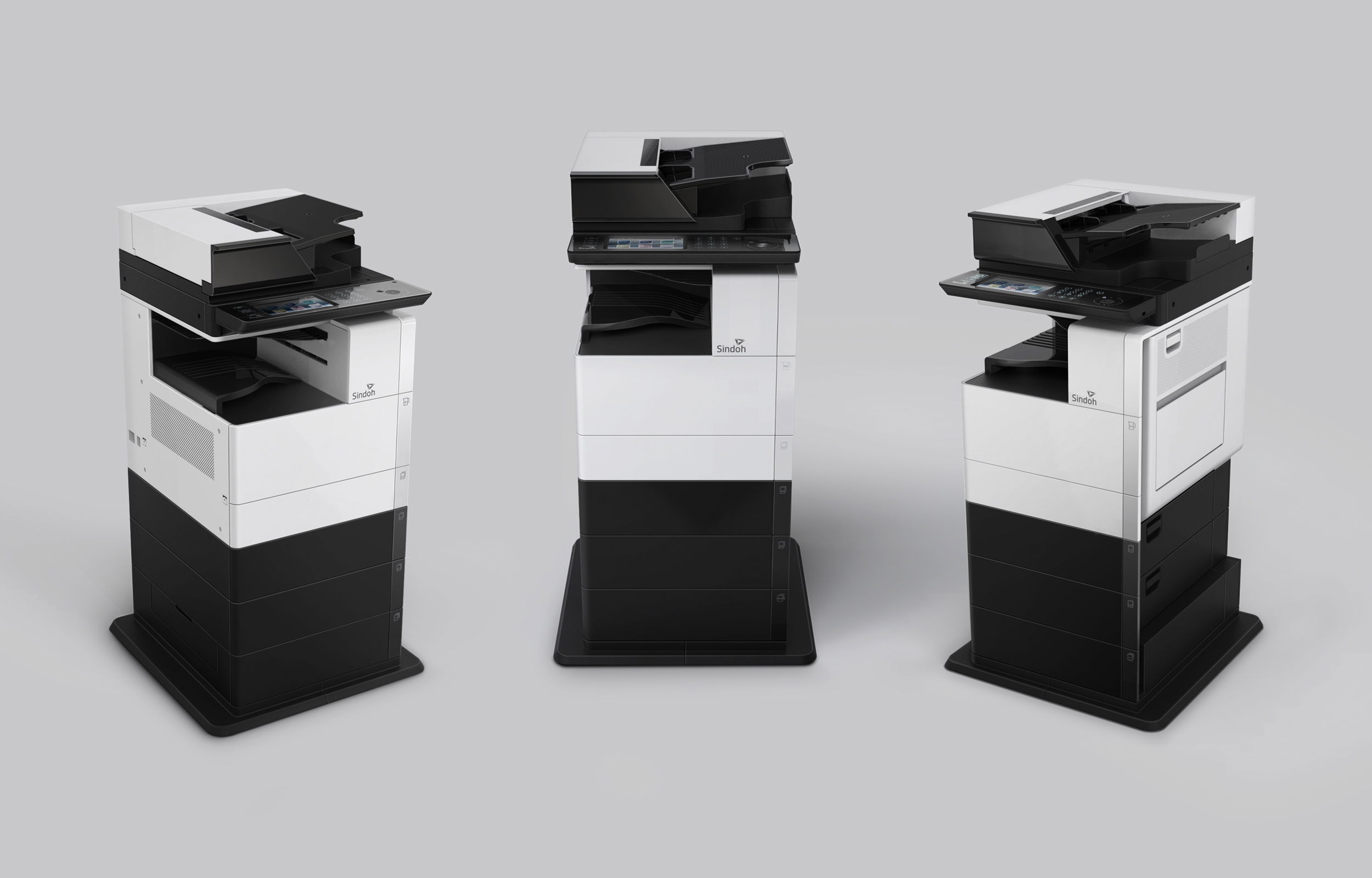
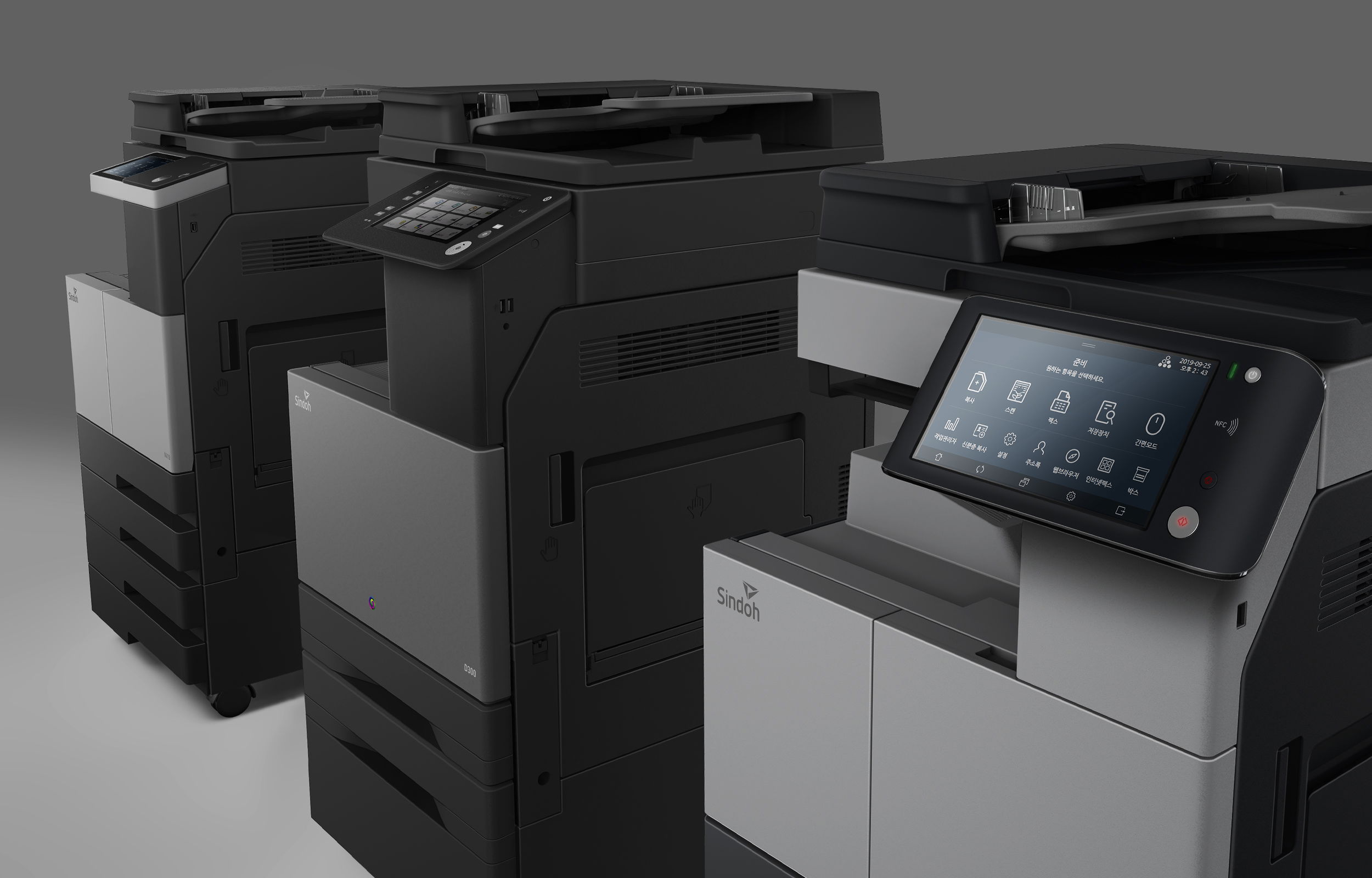
The range is unified through a progressive design language which creates a strong family resemblance that builds and evolves from entry level machines up to the high-performance copiers. Simple, intuitive graphic user interfaces (GUI) were developed for the larger copiers, bringing a thoughtful simplicity which defines Sindoh printers as joyful to use.
Landing
A design strategy was established to help form a single strong visual identity that is capable of growing with each successive range. We called this our ‘evolutionary stable’, where every new product builds on the last, but with the flexibility to be reactive to the market and able to offer a variety of visual identities to suit different tastes.
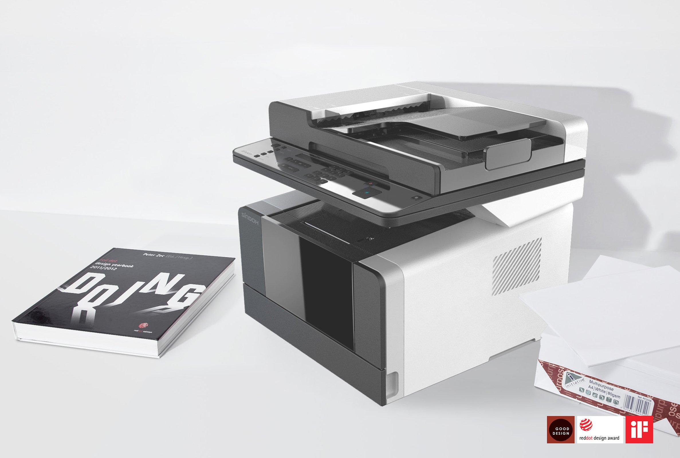
This first range was well received by the market and critically acclaimed by our peers, winning a number of prestigious design awards including the iF and Red Dot design awards in Germany.
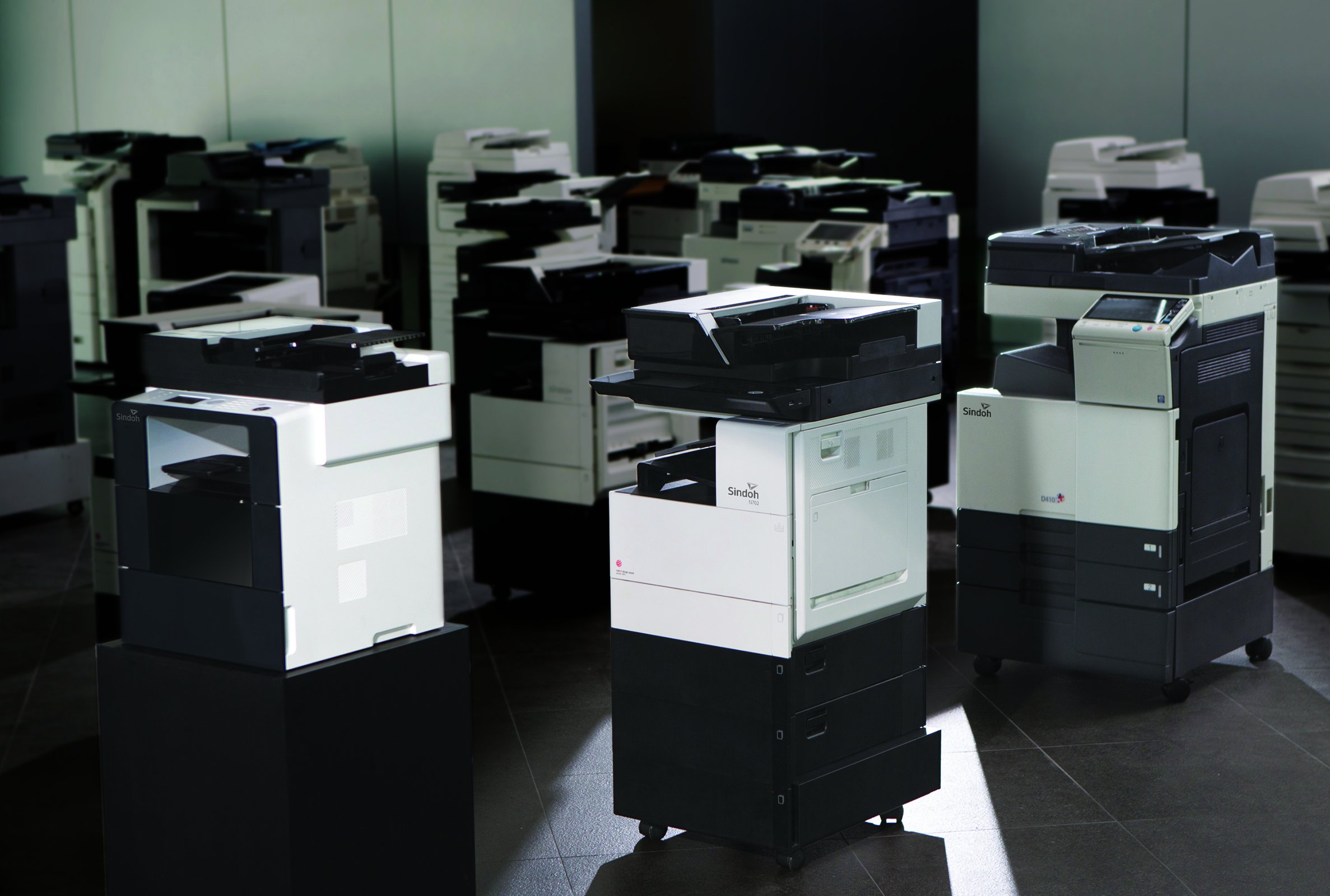
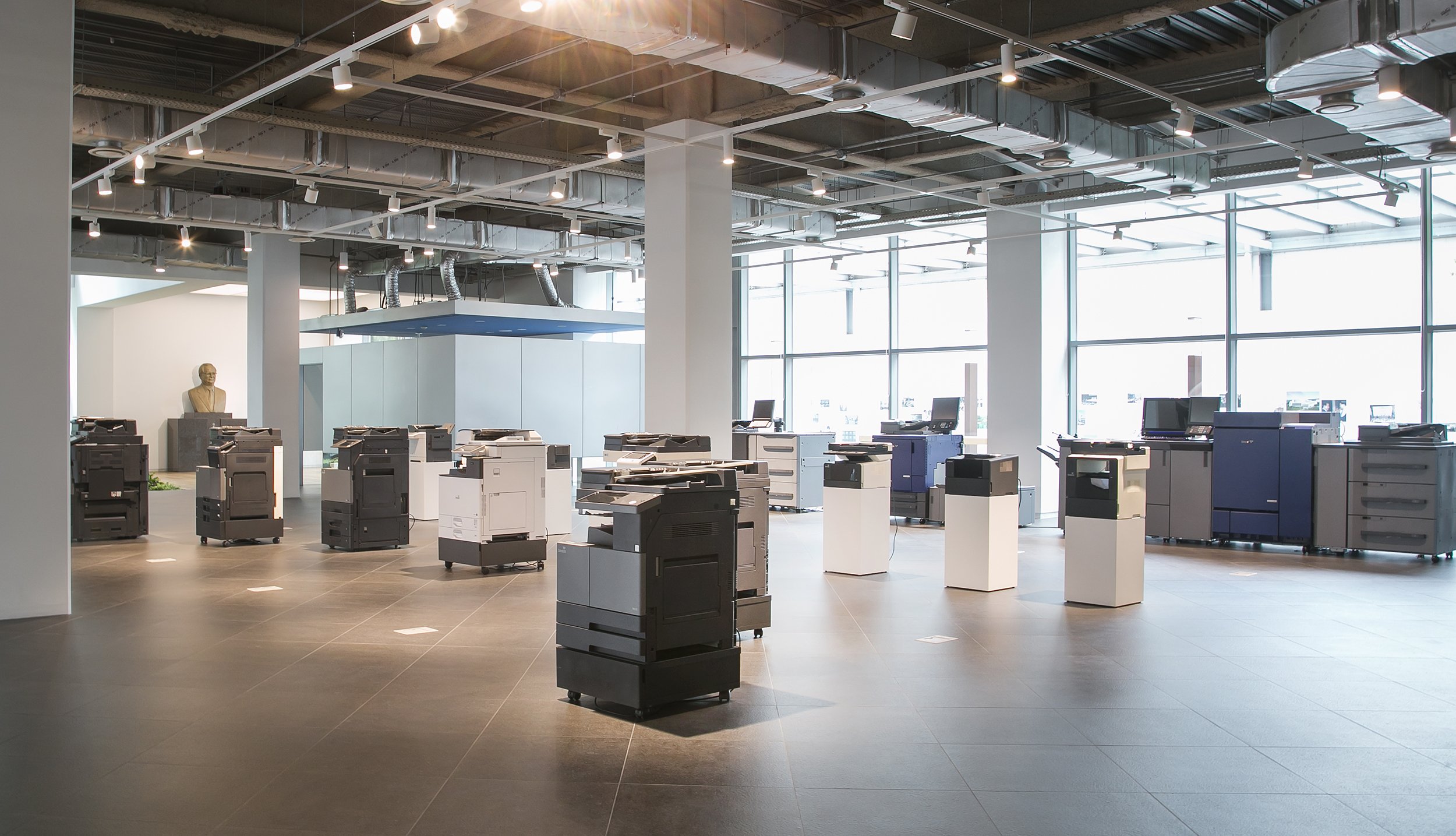
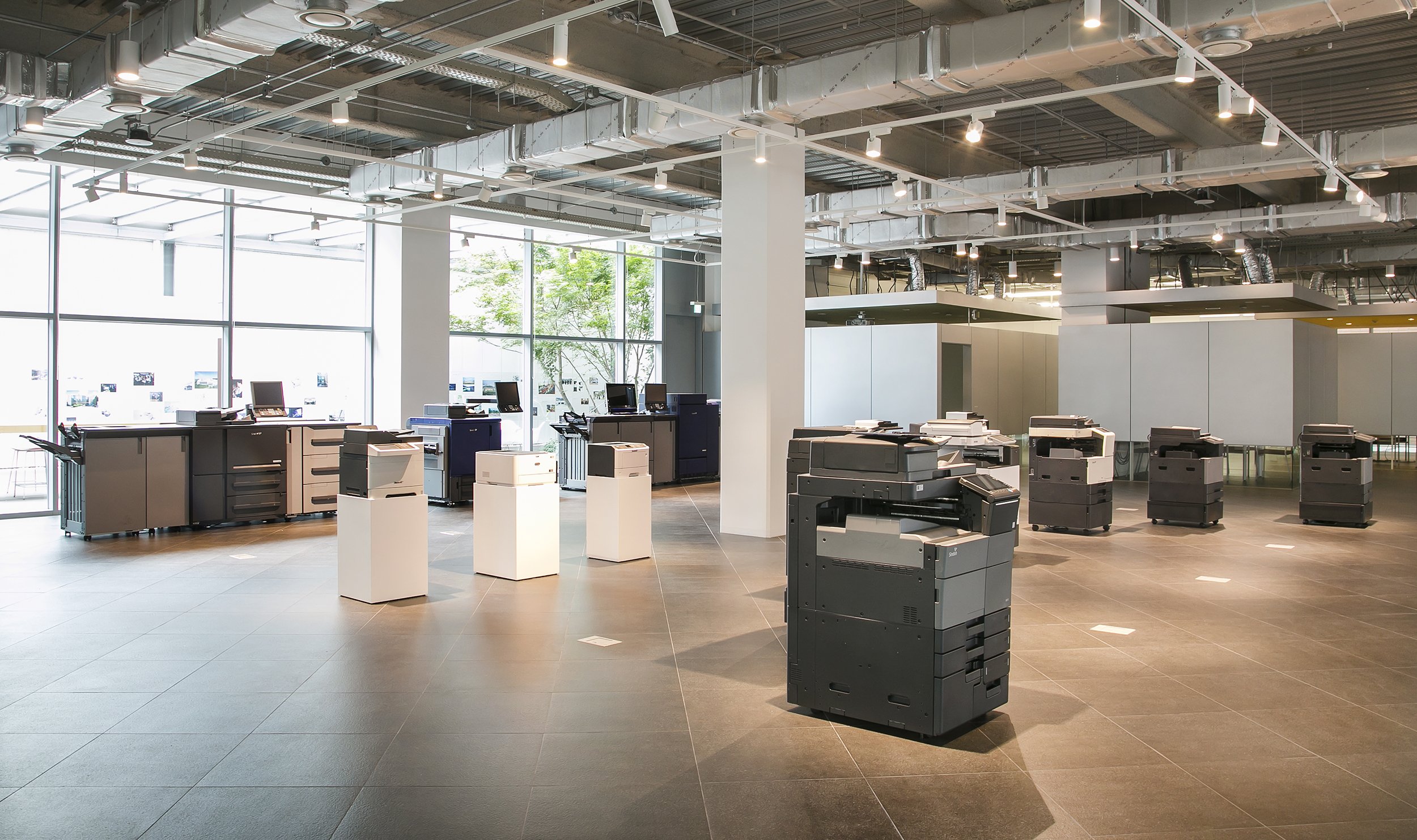
From the very first designs we have helped Sindoh to launch multiple product ranges from entry level home printers to high performance office equipment, encompassing mono, colour and 3D printers. Many have gone on to be recognised as the best in the market, winning further industry awards for their design quality.
tangerine have become like family to us. Martin clearly explains his thoughts behind design concepts and at the same time considers the position of Sindoh. When adjustments based on our staff feedback were needed, he came up with the best solution without breaking the entire concept. I have come to trust his philosophy
Chairman and CEO at Sindoh