Retail store strategy, wordmark design and packaging

Having successfully set a new direction for Innisfree’s business with the Pan-gyo flagship beauty store, we were invited to develop a strategy for the customer experience that would roll-out across all of Innisfree’s retail stores, accounting for the different footprints and formats. The brief was to further develop Innisfree’s brand proposition and to widen its appeal.
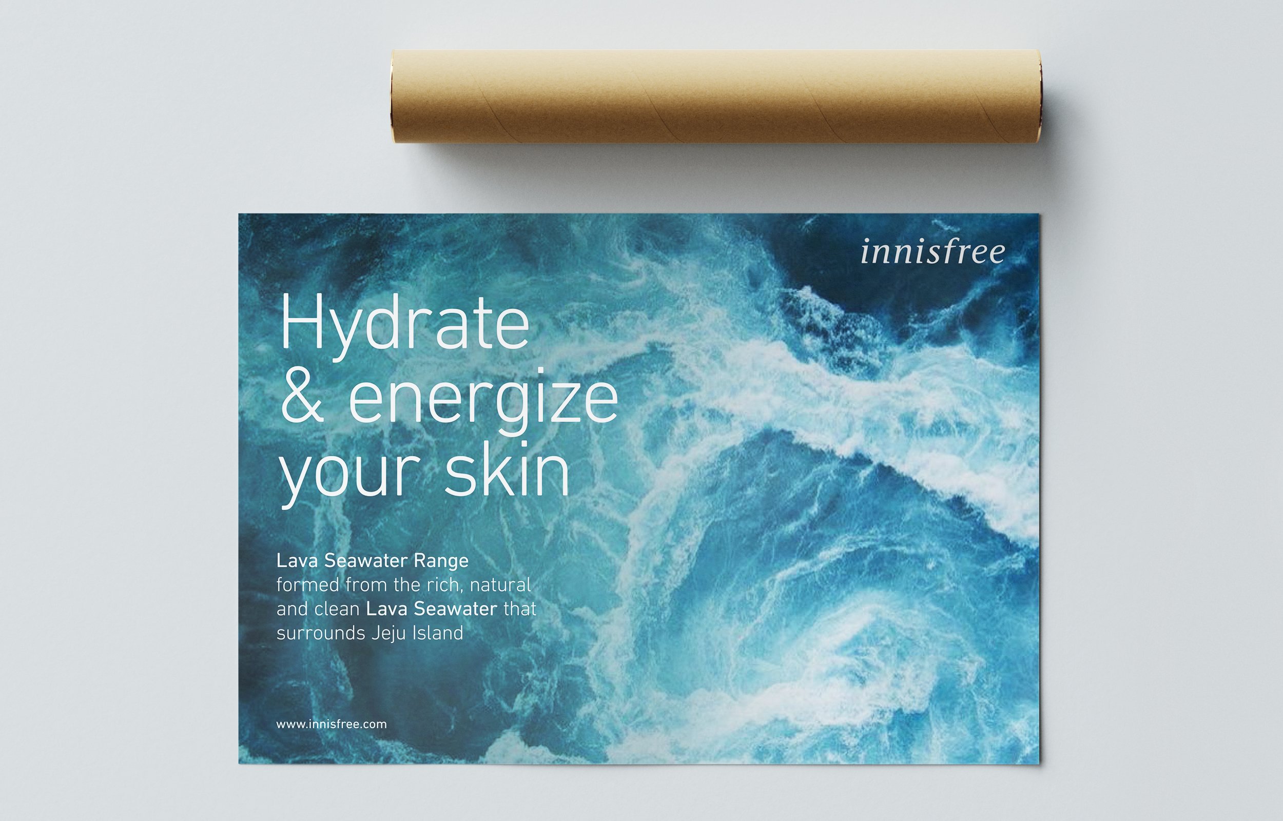
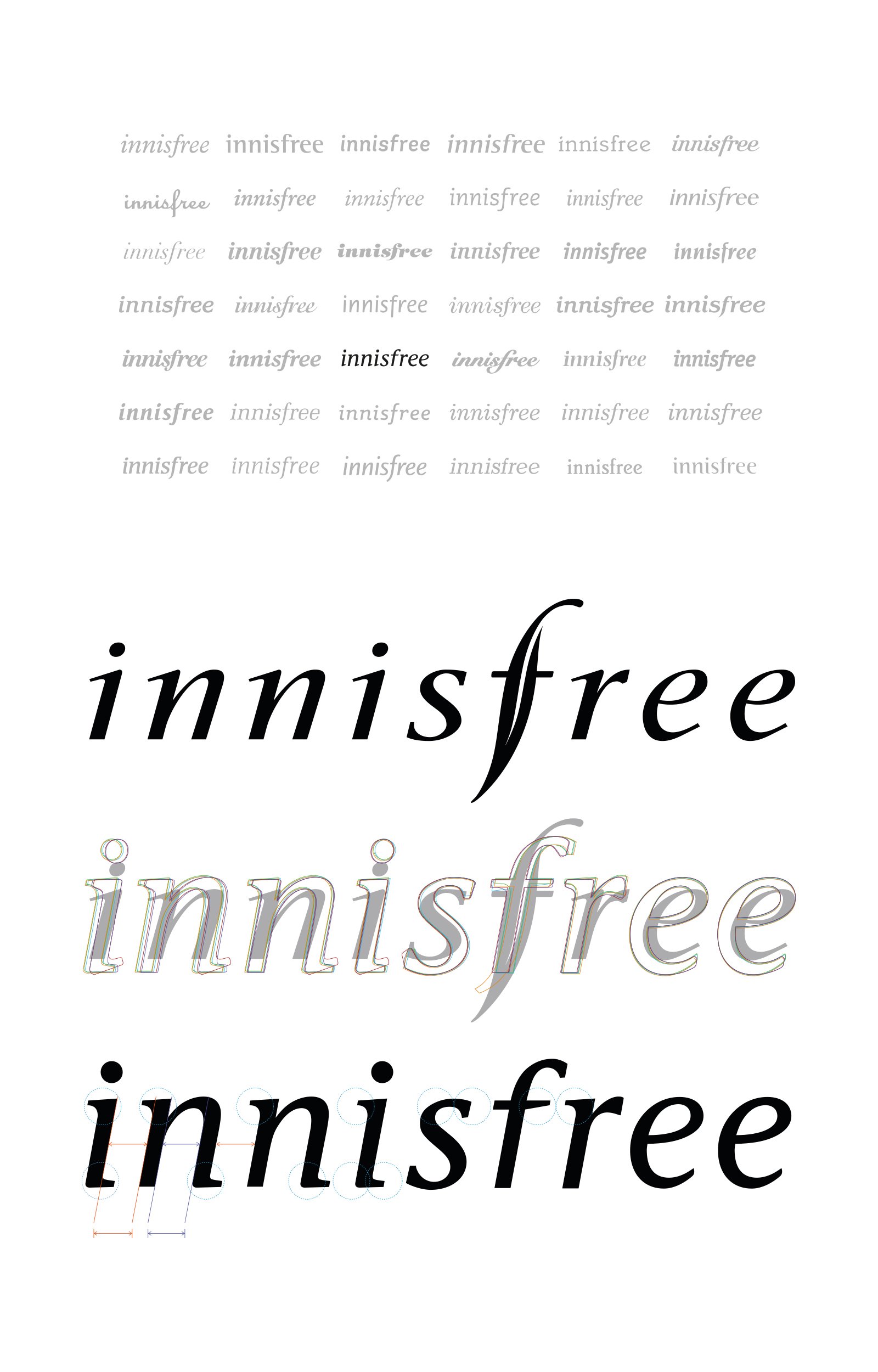
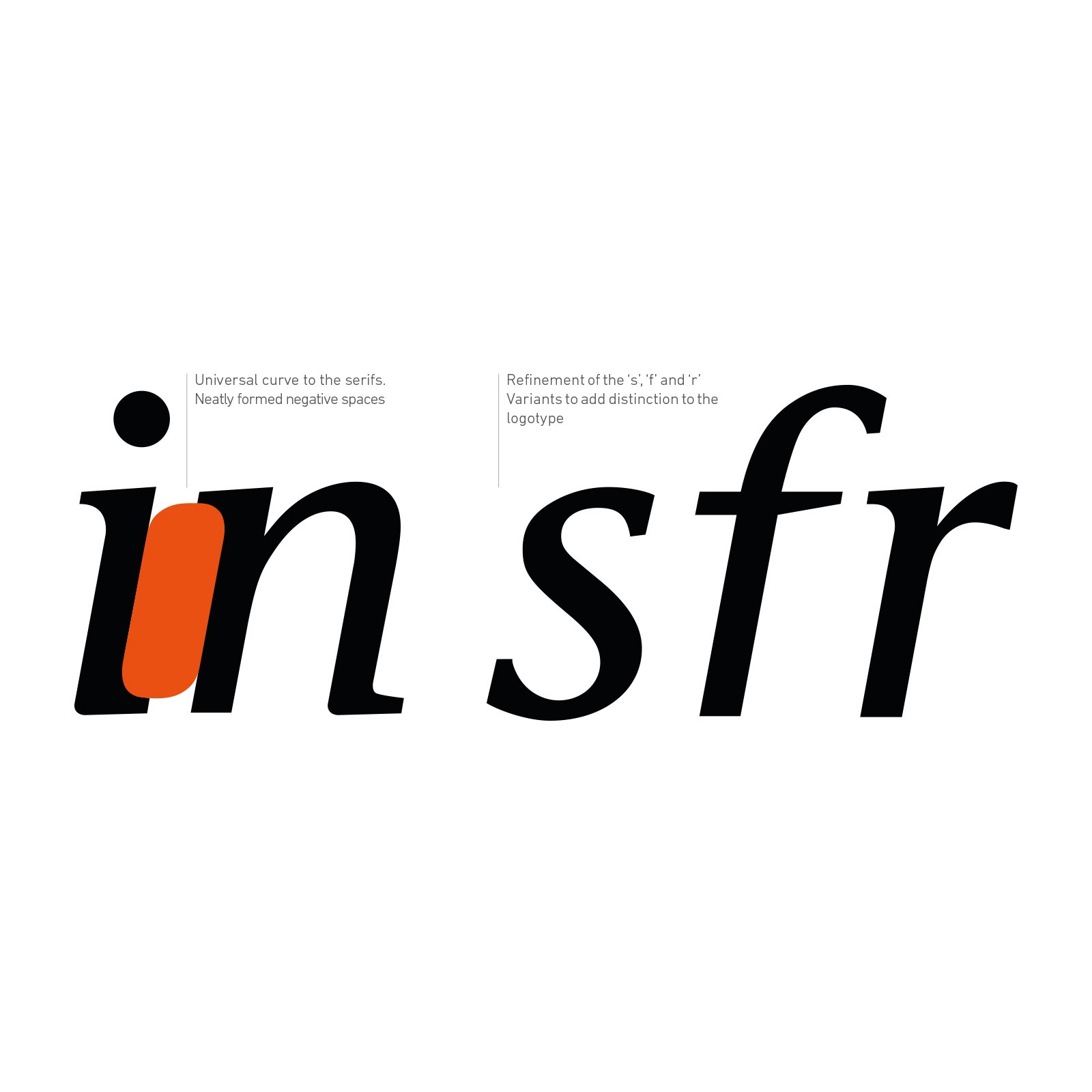
The most significant outcome of the project was the design of a new wordmark for the global natural beauty brand, which would become the fresh face of Innisfree across all its channels.
Services
- Positioning and Strategy
- Brand & Identity
- Wordmark Design
- Packaging Design and Graphics
Learning
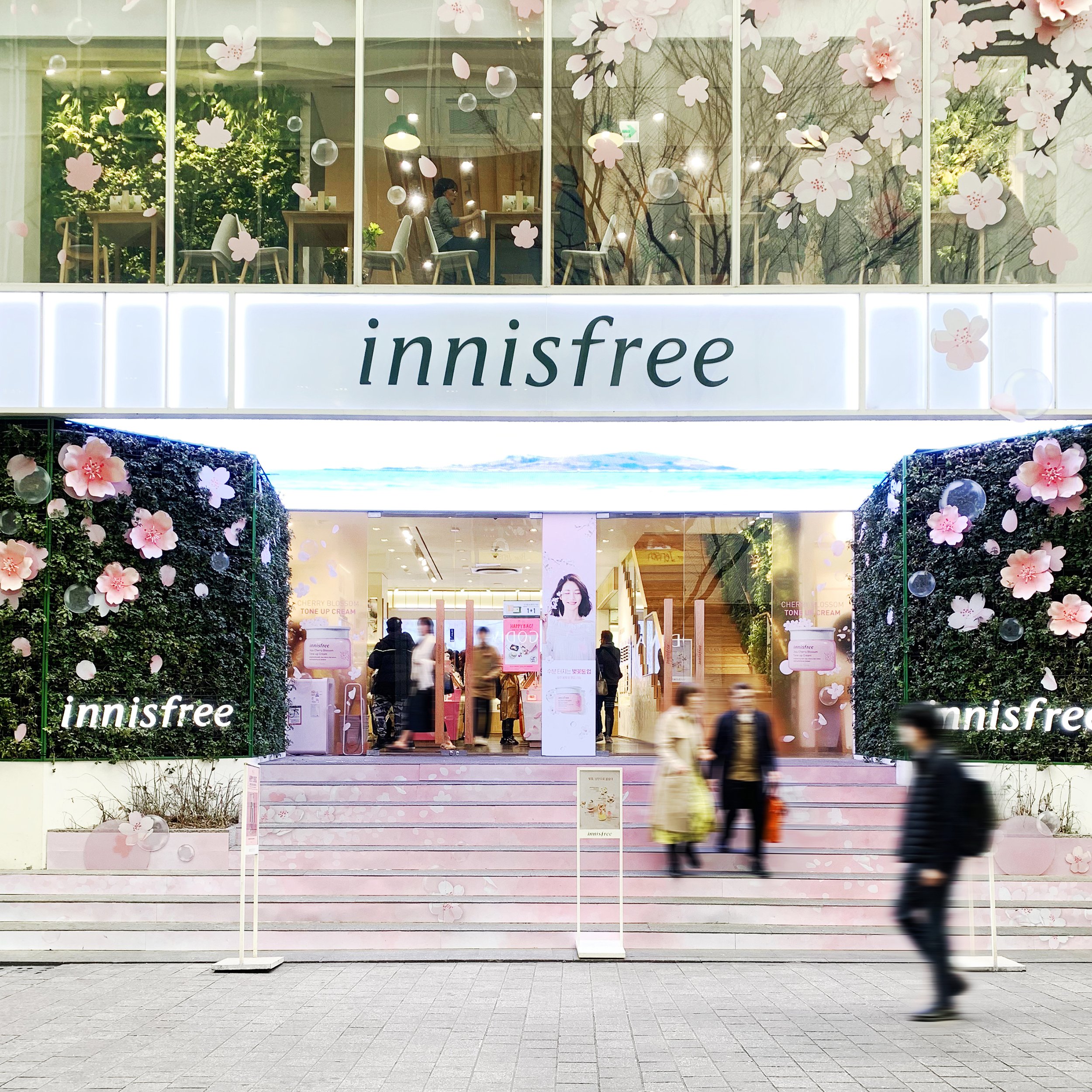
During the design of Innisfree’s Pangyo flagship store, we identified that the focus on Jeju Island lacked appeal beyond its Asian markets and narrowed the potential to expand Innisfree’s product portfolio.
We established a brand concept to underpin the development of their retail experience, which centered on the idea of “Real Natural Living”. This drove the definition of the customer experience and design of the store. It created strong connections between the natural ingredients found in the products and influenced the choice of natural finishes used in the interior design.
New features, such as the, Green Café introduced a place where customers could enjoy related F&B and immerse themselves in carefully curated home products from partner brands , expressing a healthy, natural and a more sustainable lifestyle.
The challenge was to move this concept from a single flagship to a brand proposition which could guide the wider retail strategy for all of Innisfree’s stores, products and packaging.
Leaping
We concluded that a driving brand concept behind shift in strategic direction to differentiate Innisfree from its competitors and plethora of copycats was the “Power of Nature”.
A subtle change, but one that convinced Innisfree’s executives to shift from directly referencing ingredients grown on the fertile volcanic Jeju island to invoking the broader concept of the potent force of nature itself, with all its raw power, beauty, fertility and tranquility.
From the experience gained through designing the flagship store we identified a unique opportunity existed to translate our learnings into a new guiding proposition to move Innisfree’s brand forward.
Landing
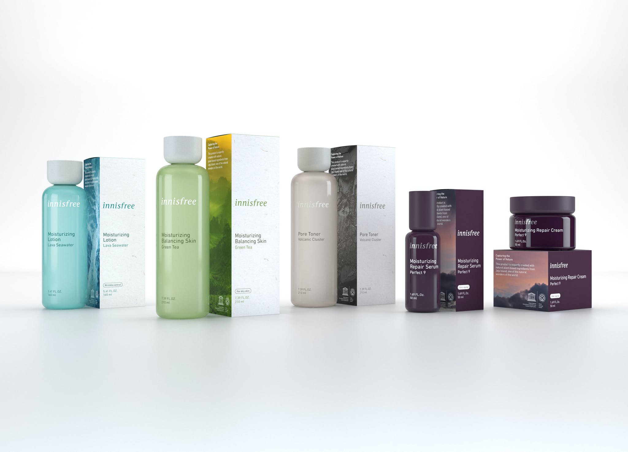
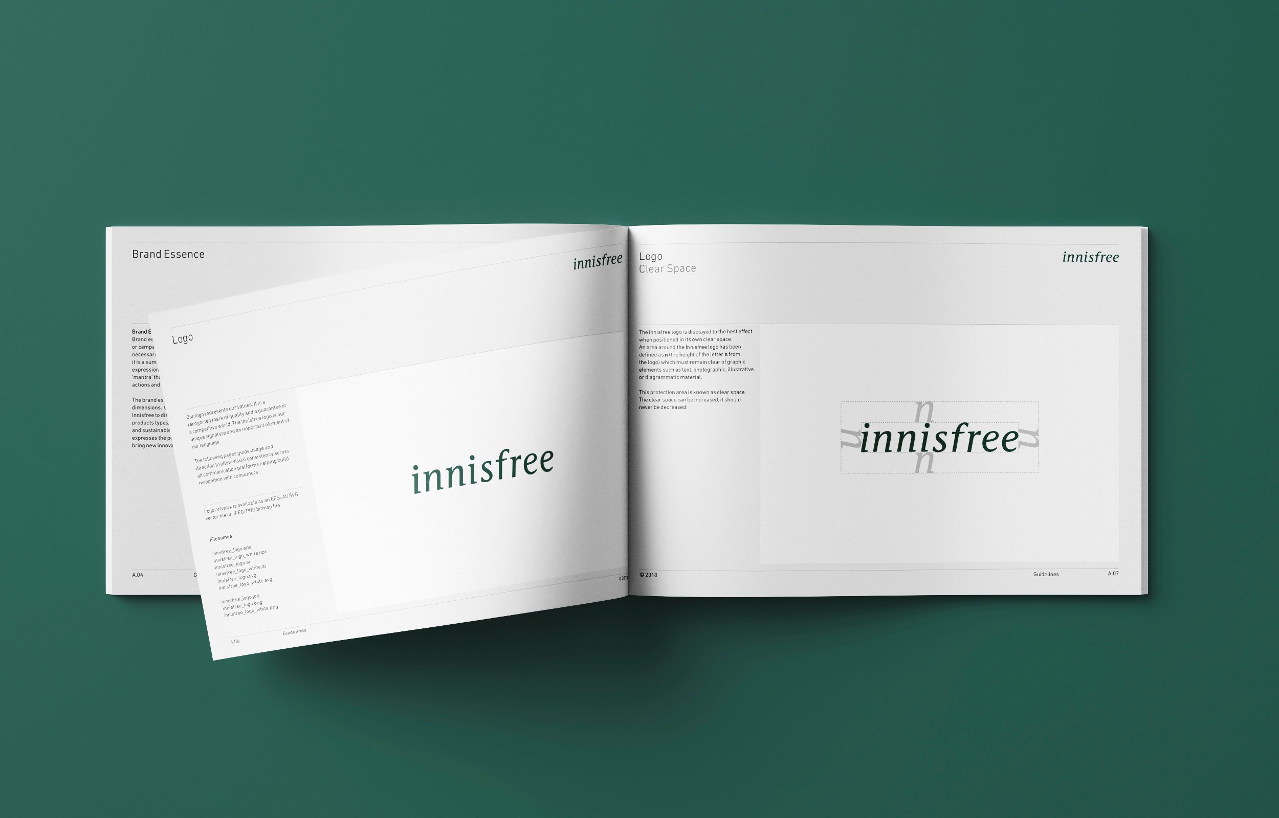
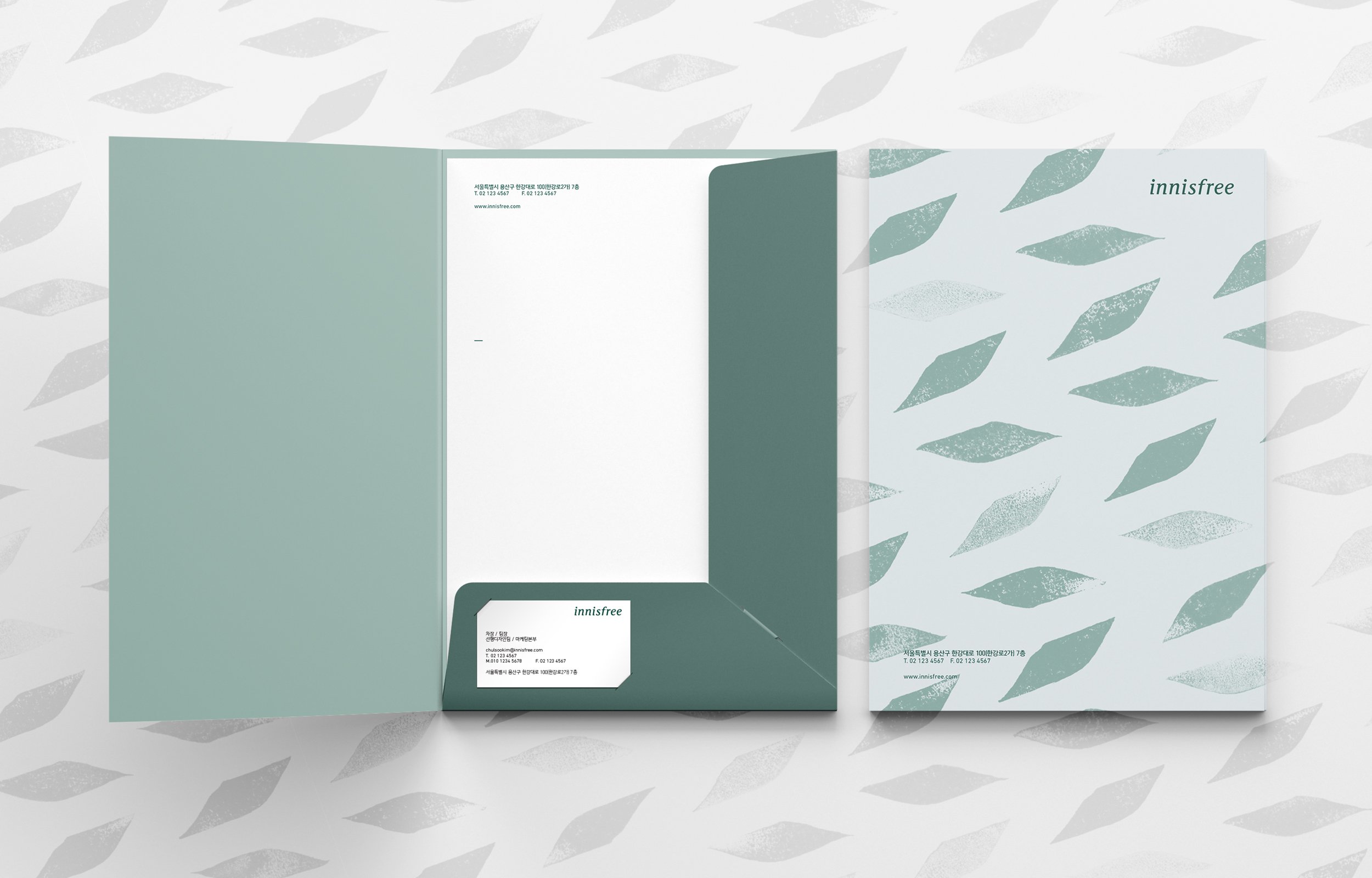
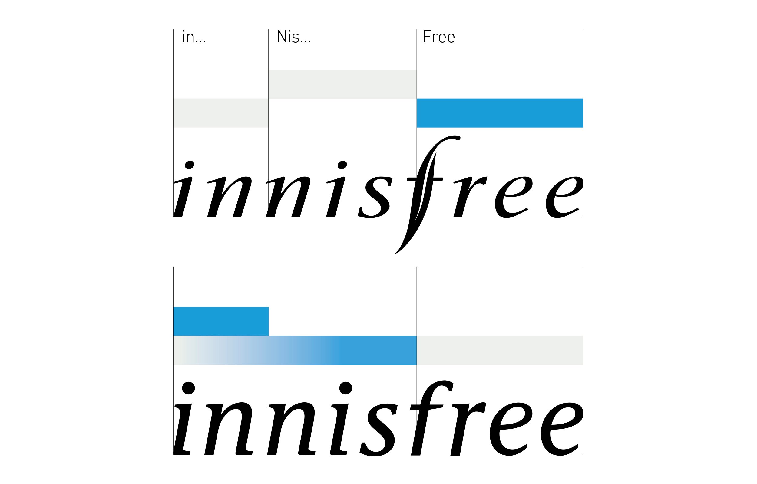
We redesigned the Innsifree logo, adapting the serif to create a simpler, bolder typeface, which is better proportioned within its width and height dimensions, giving clearer application in every context.
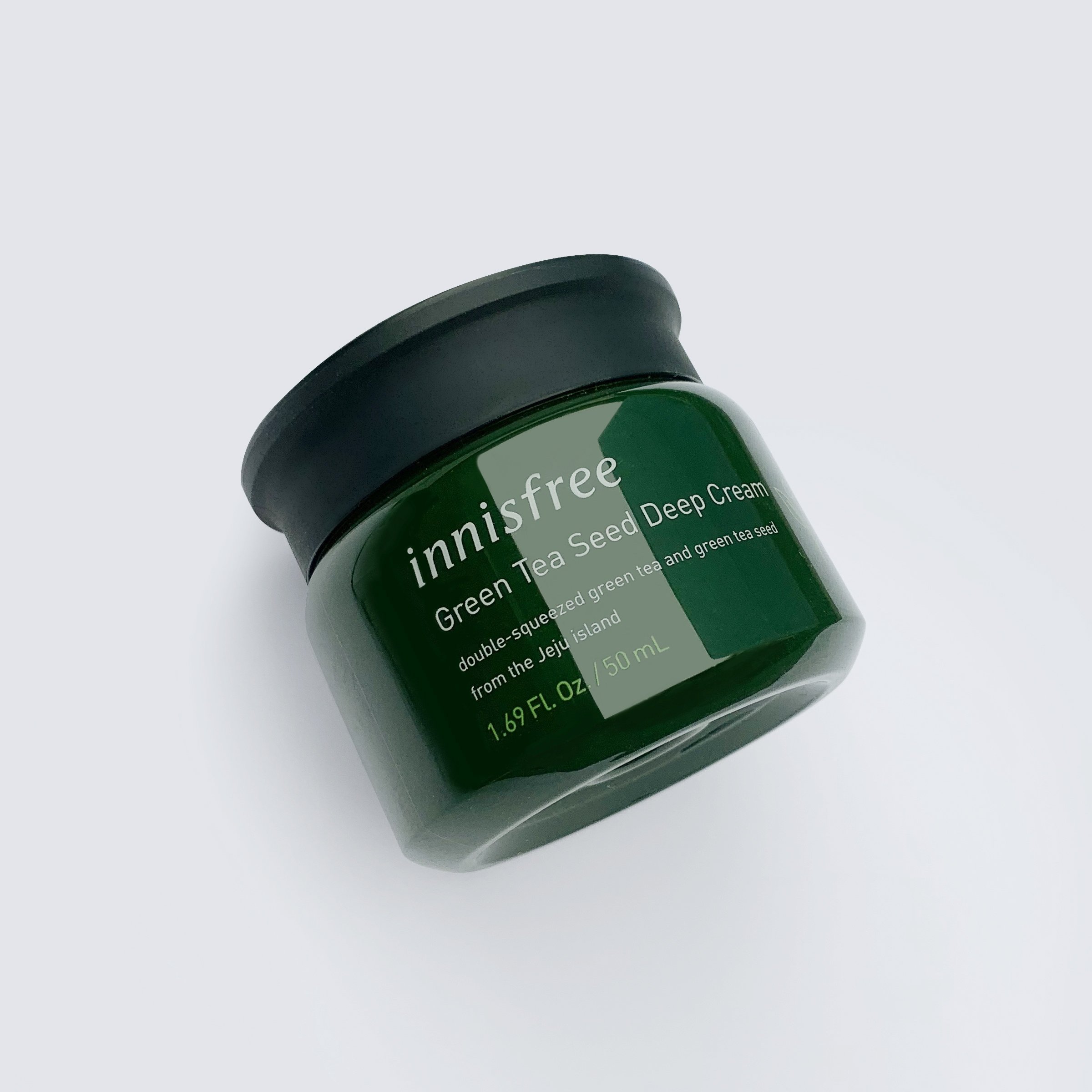
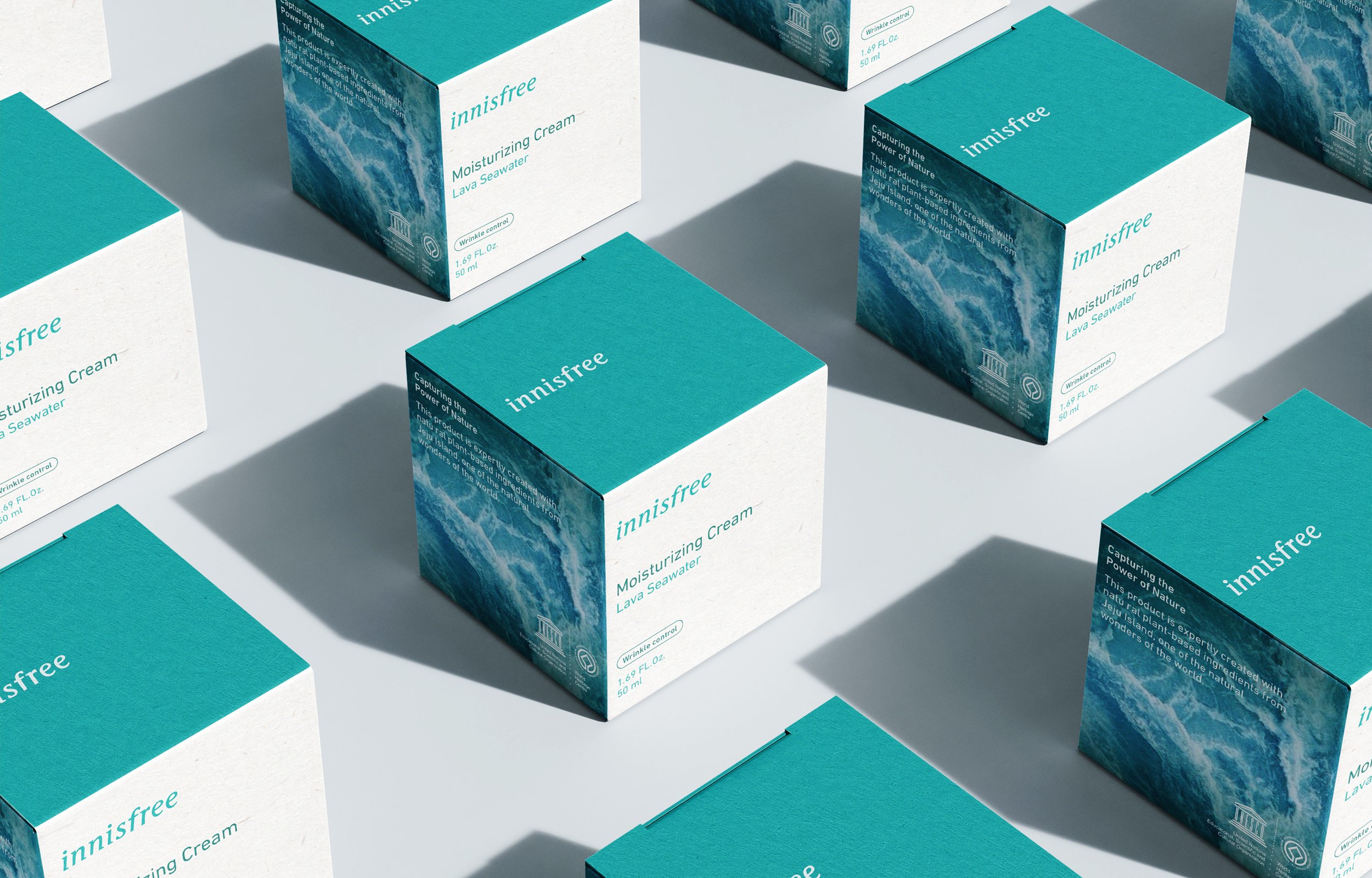
We also redesigned Innisfree’s product bottles and packaging to exemplify the new “power of nature” brand proposition. With a range launching instore and our concepts continue to inspire future ranges today.
Overall, we created concepts and plans for a range of different store types, providing a successful framework for Innisfree to further develop and rollout as it expanded its retail presence in Asia and beyond.