Corporate Identity to transform a manufacturing partner into an original brand

To build a successful global brand, cultural divides must be traversed, a company’s values defined and differing philosophies embraced. A Corporate Identity is also more than a badge it is the ‘face’ of that organisation; it needs to convey the right values and qualities to the market.
Sindoh’s ambitious and design aware CEO asked us to help them define a distinctive consumer facing identity for his family owned business to support an ambitious move from being a manufacturing partner of copiers for other globally recognised brands, to launching a collection of innovative own brand 2D and 3D printers.
Services
- Vision Setting
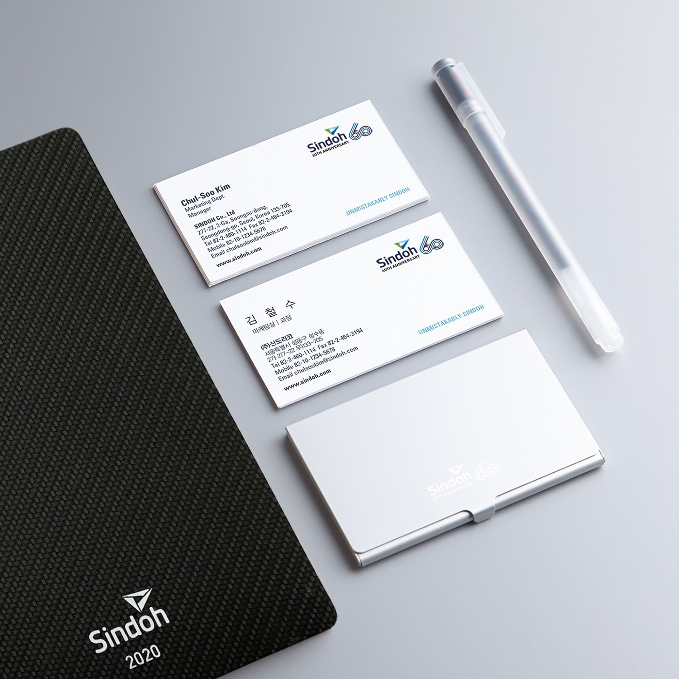
- Brand and Corperate Identity
- Brand Strategy
- Graphic Design
- User Experience & UI
Learning
Sindoh has an established an enviable reputation as an exemplary manufacturer partner for many of the Worlds leading printer brands. They are also highly regarded across Asia where they sell and support numerous printers under the Sindoh name.
Moving from being a manufacturer partner to a B2C brand is challenging, but we had an opportunity to exploit the ‘halo effect’ of the new machines being designed, and to create a distinctive positioning relative to the global competition.
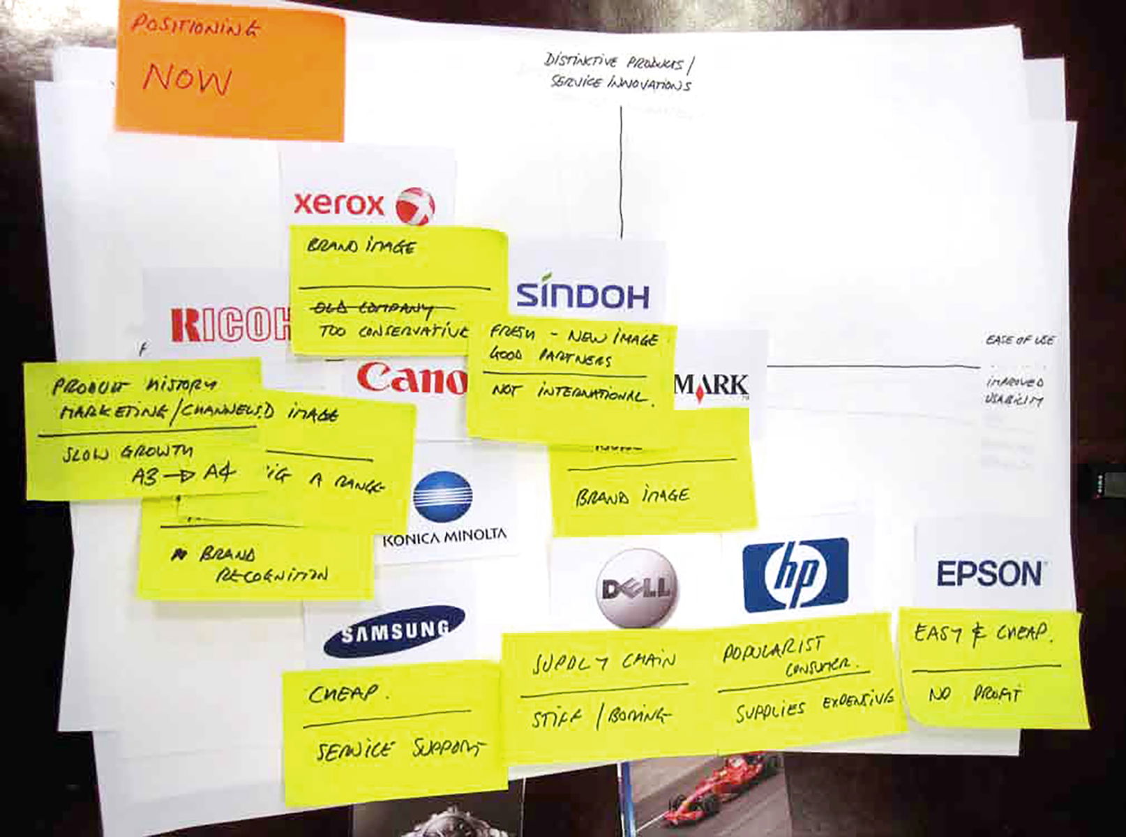
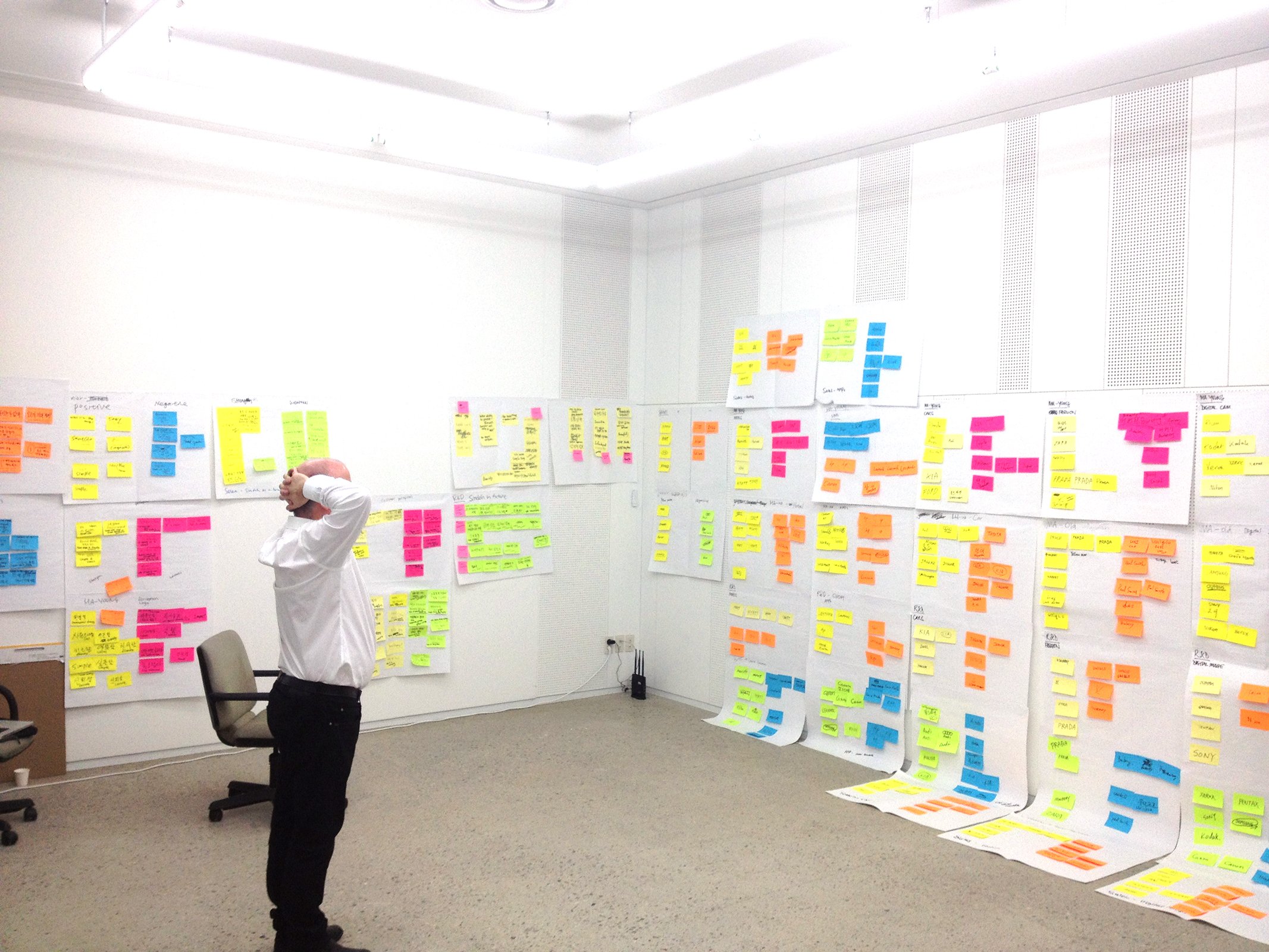
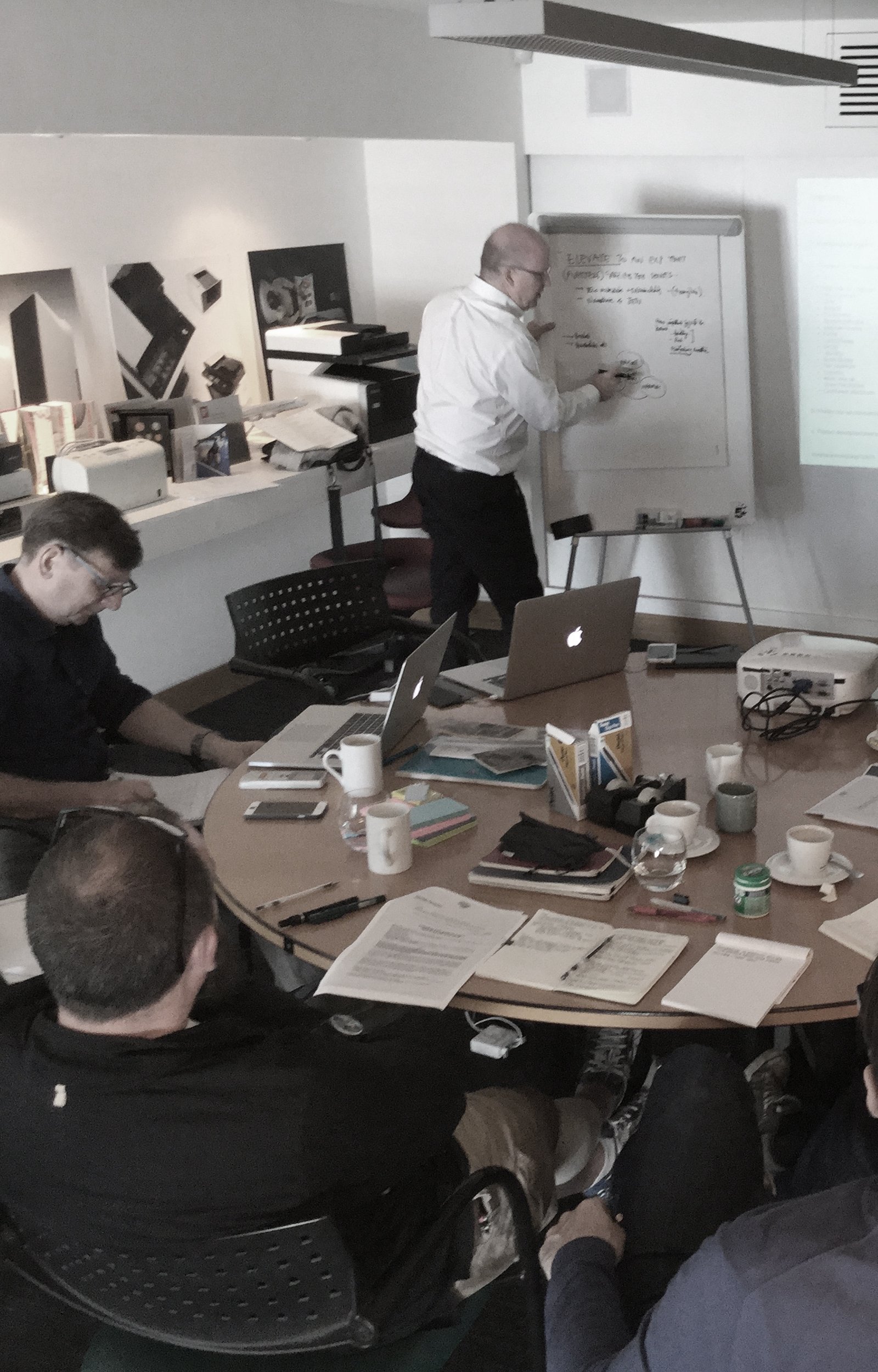
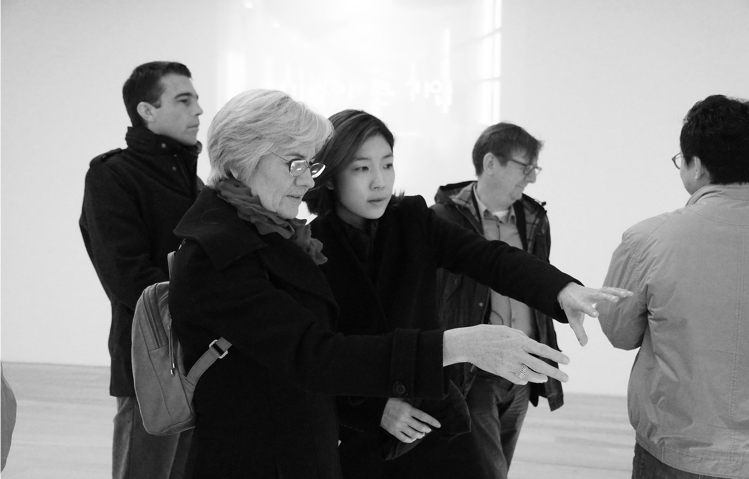
A shared view of future direction is critical for brand thinking and we held interviews with Sindoh’s executive team and key customers, rolled up our sleeves up, and ran workshops with their internal teams to brainstorm and define a clear brand framework.

Leaping
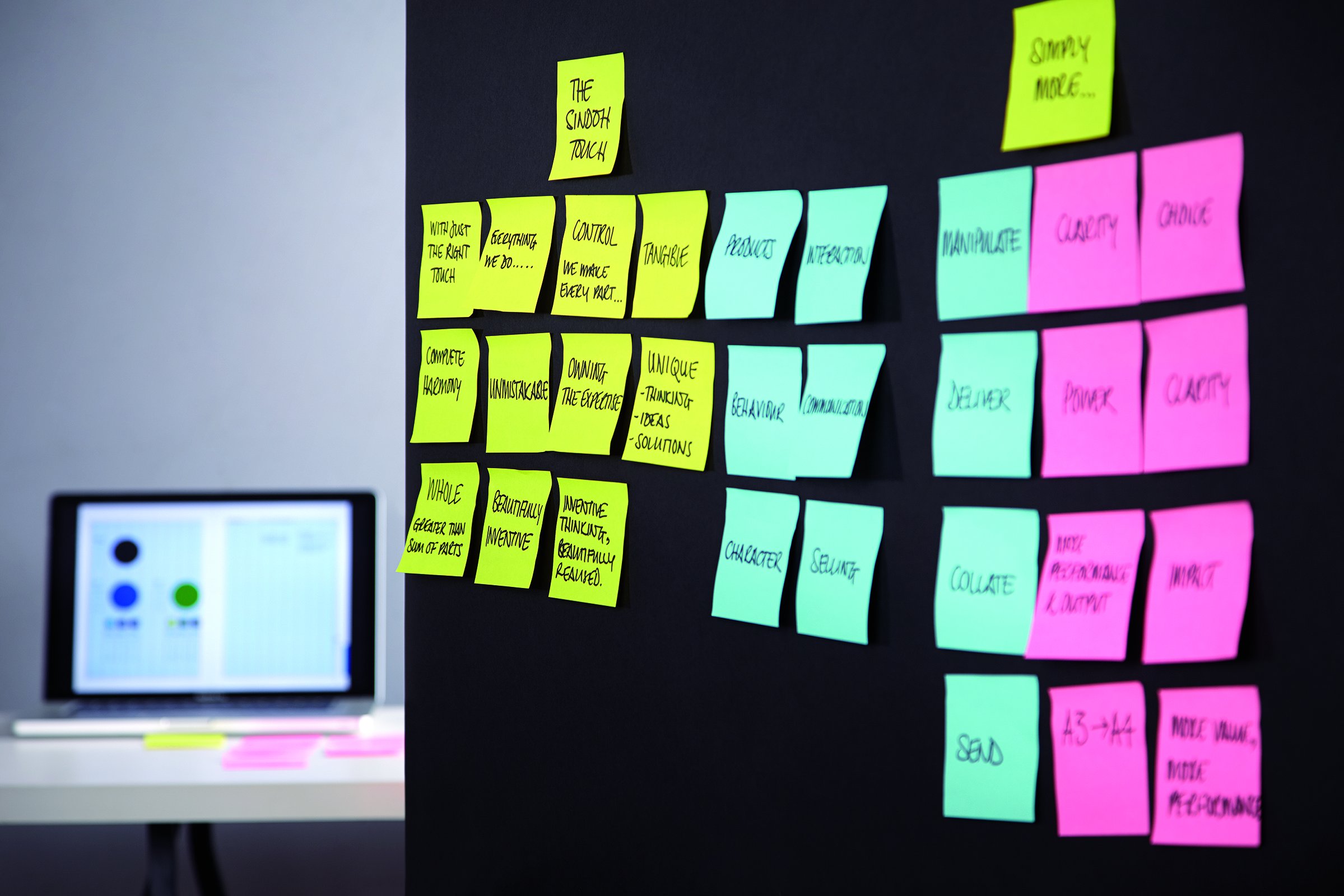
tangerine ran a series of workshops challenging staff to identify the strengths and weaknesses of their brand. Cross-cultural brainstorming revealed strong business attributes despite its lack of brand, Sindoh was still seen as a thoughtful, creative, and expert organisation. The spirit of love for country, workplace, and people, evoked by its founder Woo Sang-ki, shone through.
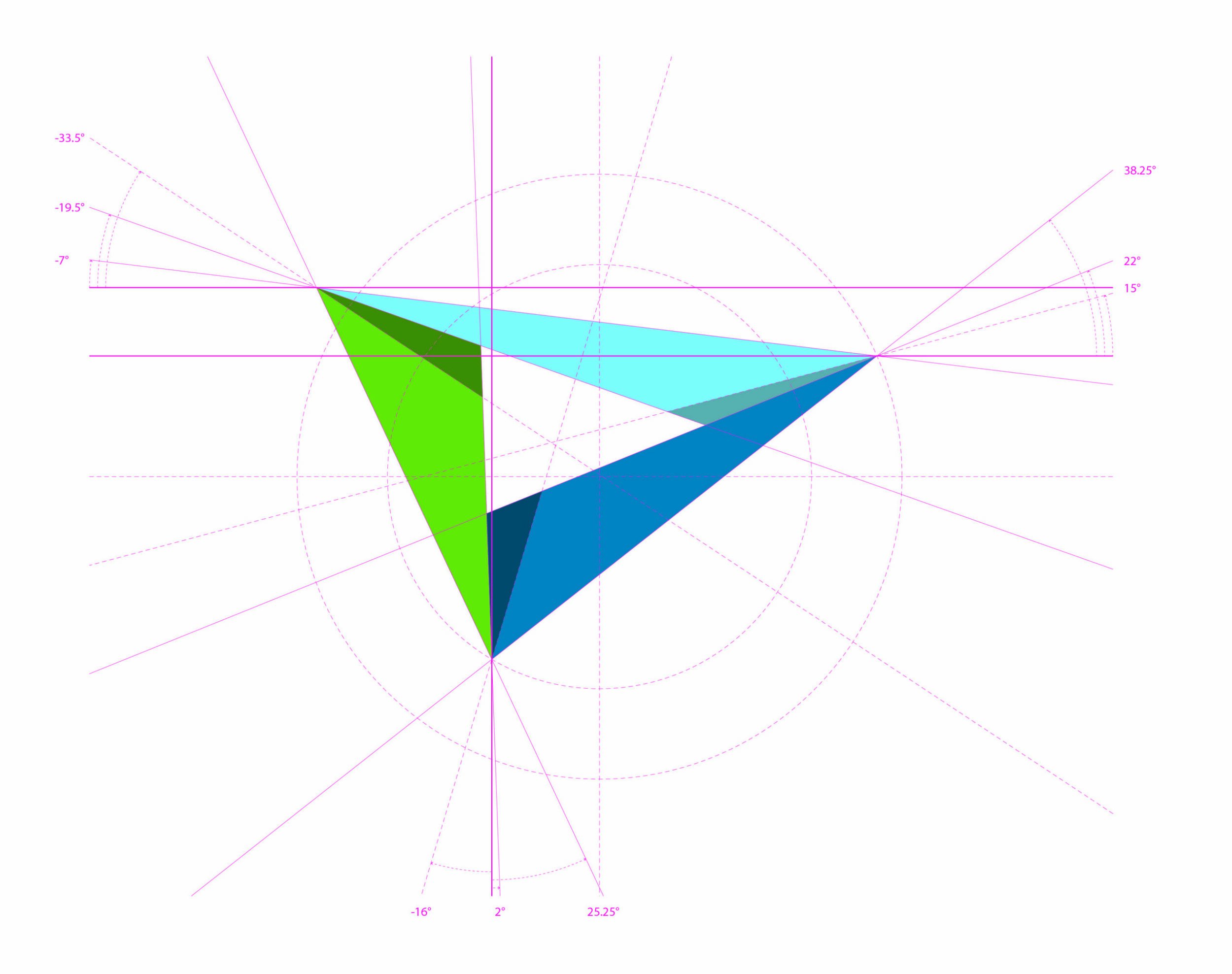
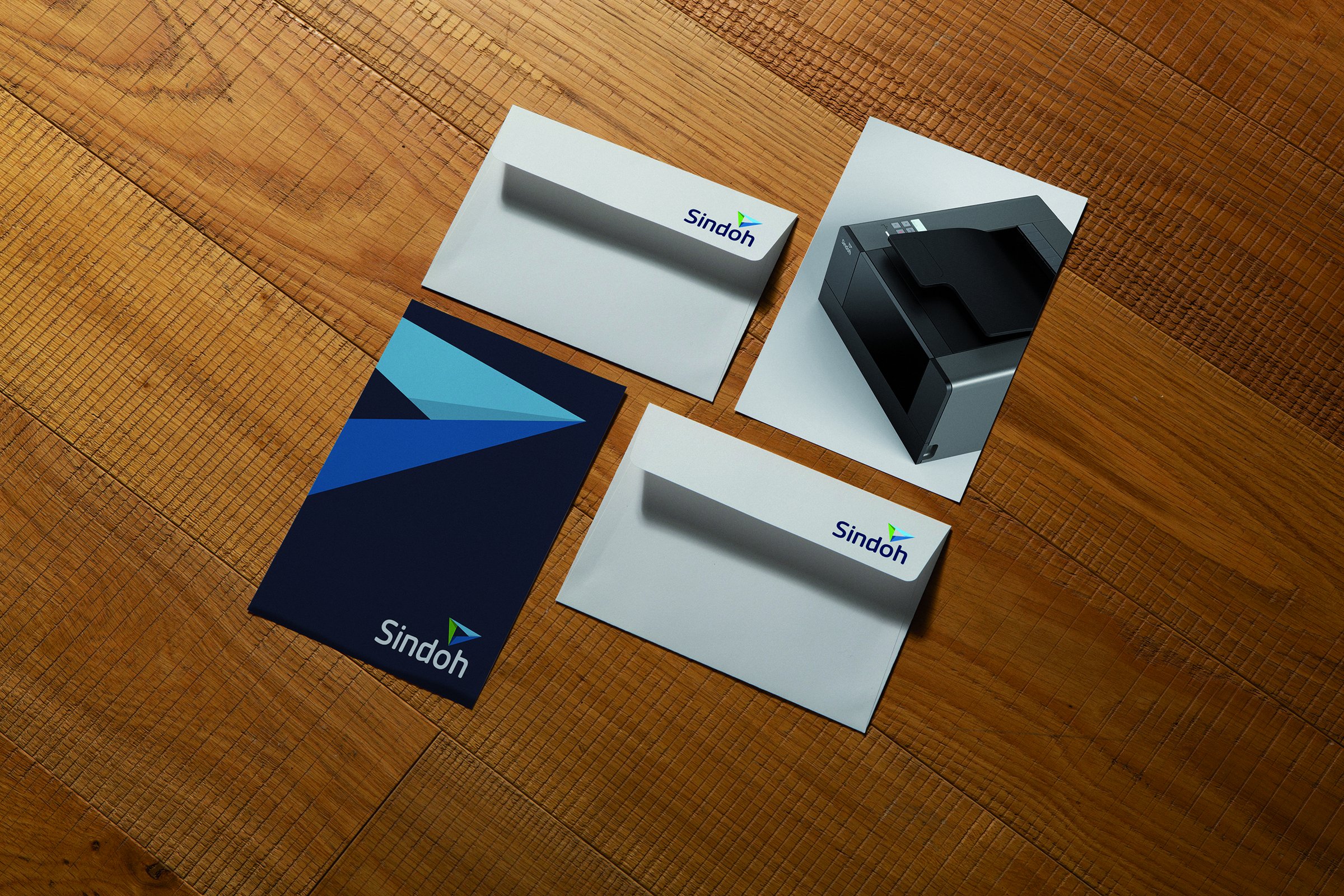
It was imperative to evoke these three strengths in the design of the new CI. Taking those strengths, we worked together to shape a new corporate identity that announced Sindoh as a confident brand in its own right. A word strange even to English ears had to be translated – ‘trimobious’ – a three-sided shape made from three triangles with the intriguing properties of a Möbius strip.
Landing
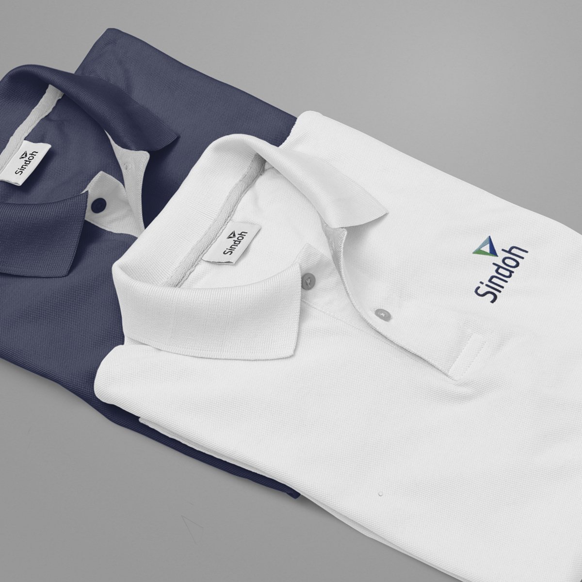
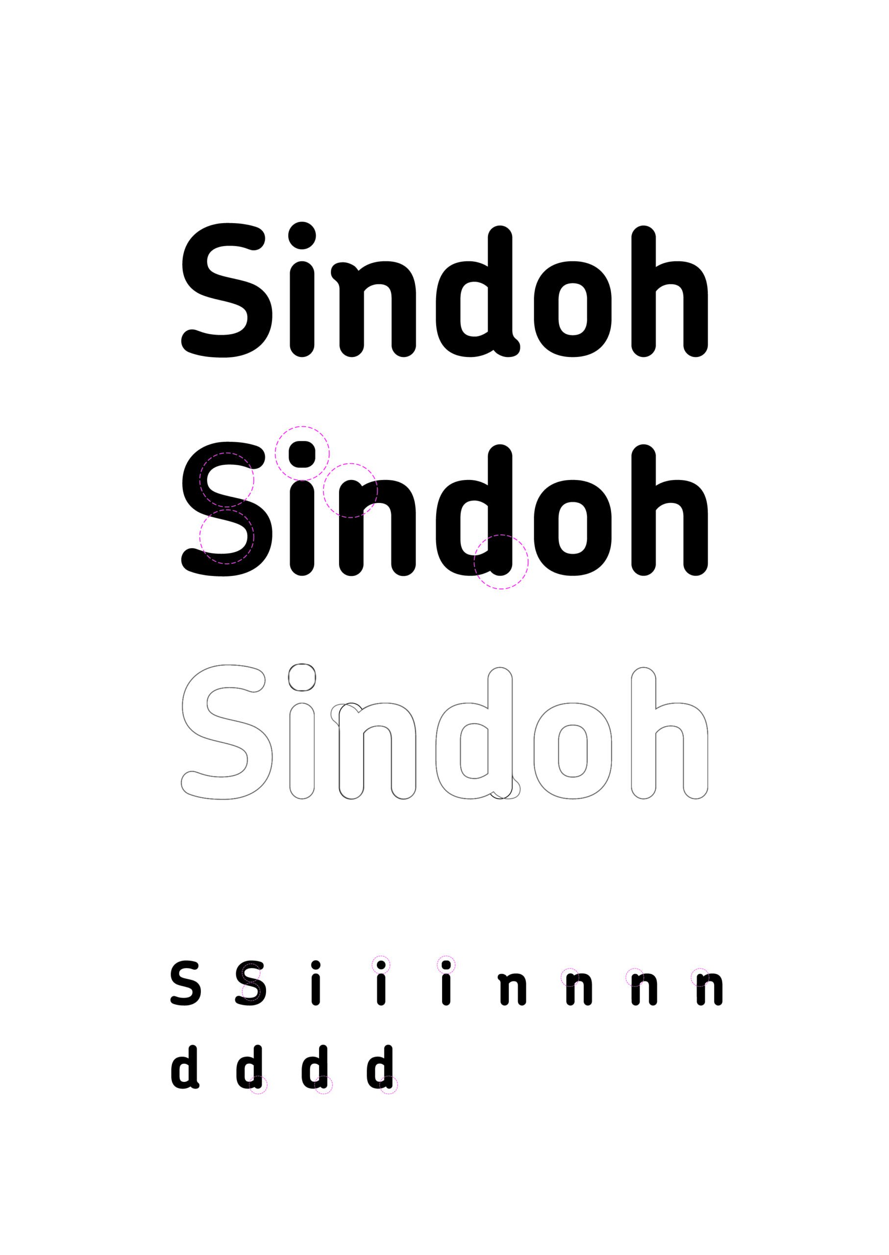
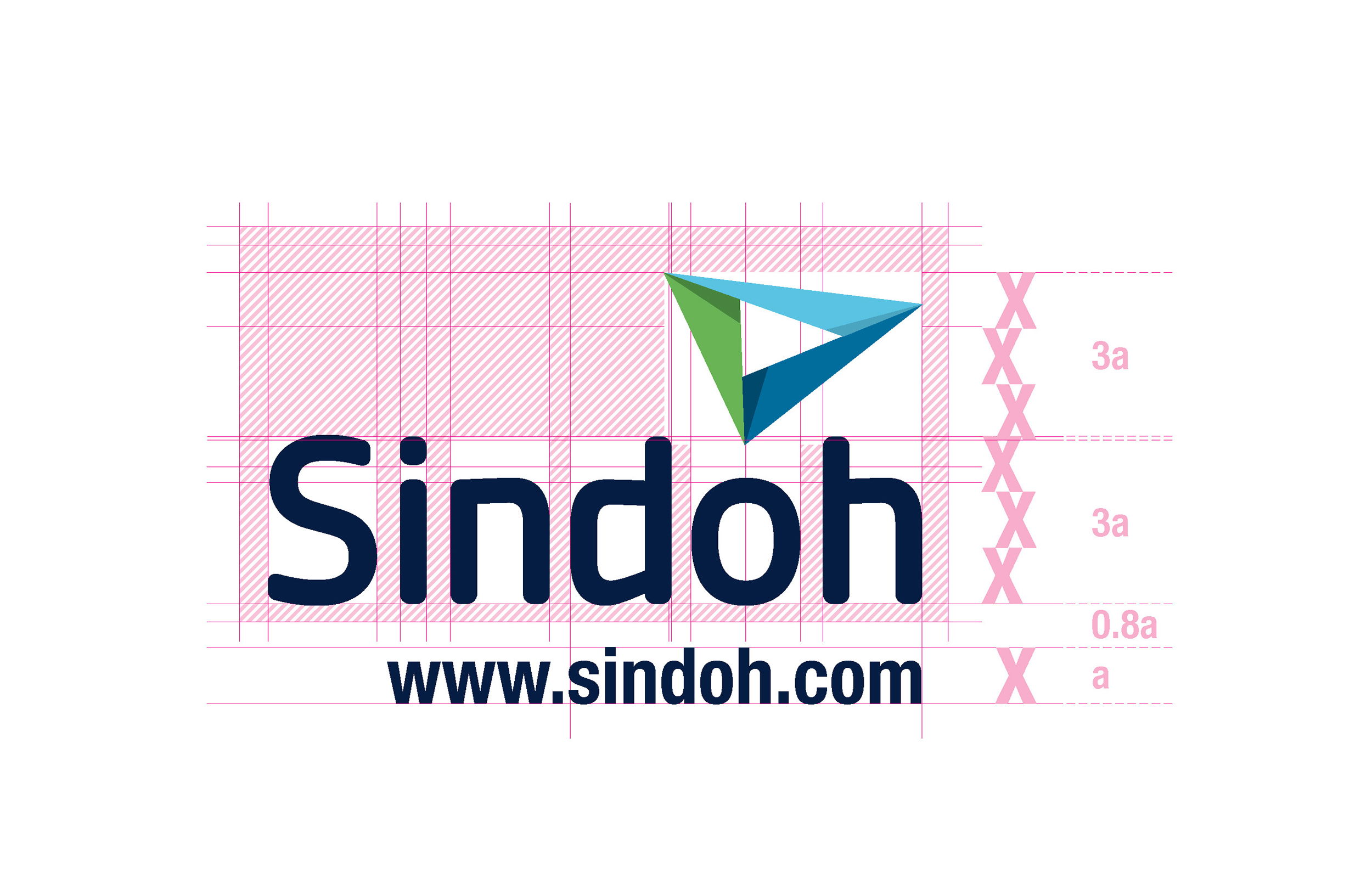
Their new wordmark evokes the quiet confidence that Sindoh now possesses and, importantly, has a human quality that is so central to their philosophy. With the ‘i’ of Sindoh purposefully representing a person.
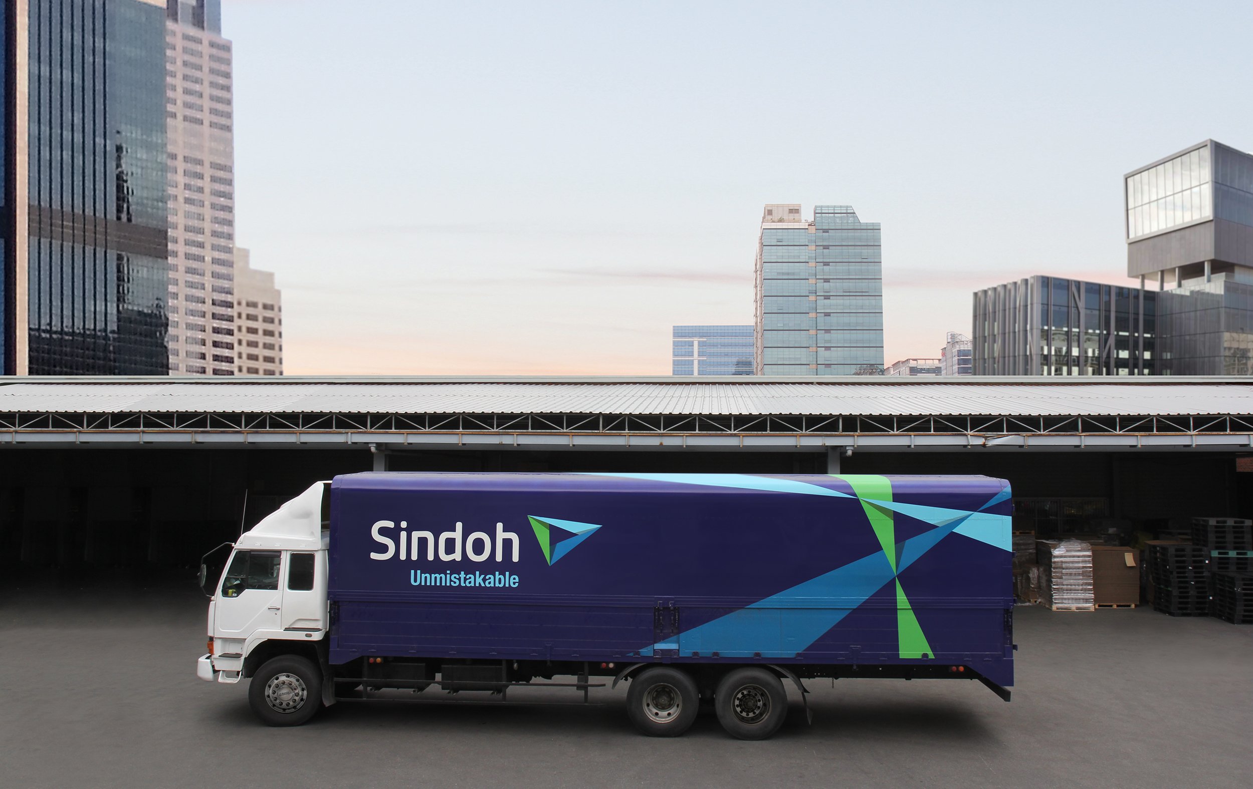
The three-sided Möbius form of the logo represents the organic connection of three core corporate belief’s and is intended to be as ‘unmistakable’ as their products are in the market.
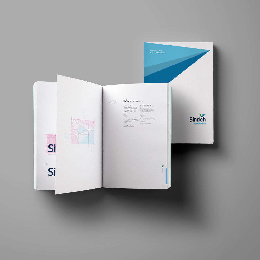
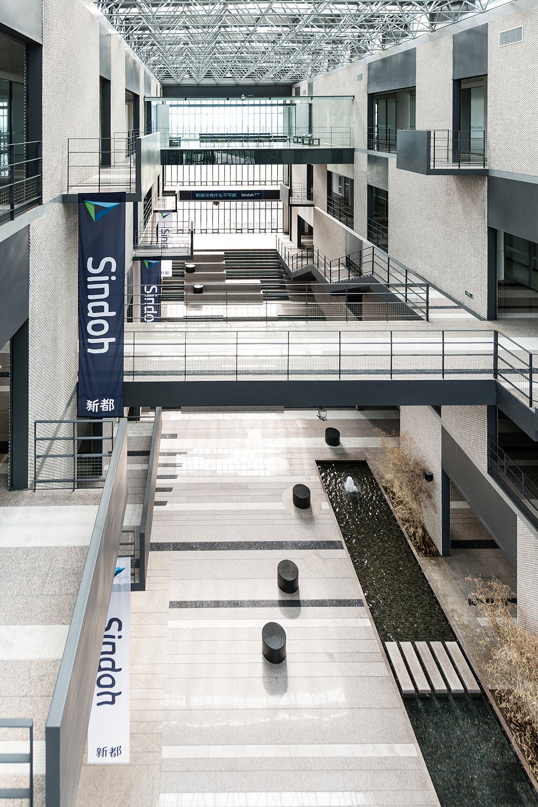
The philosophy and identity that underpins the brand has extended across all aspects of the business, giving Sindoh the confidence to sell in international markets and be a design-led organisation.
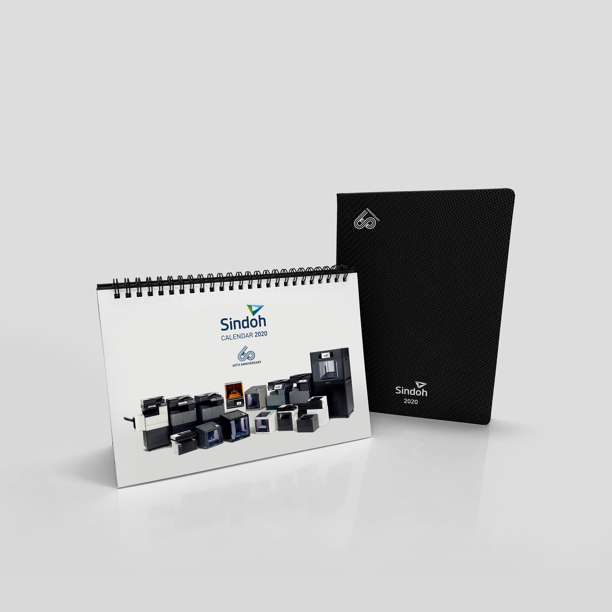
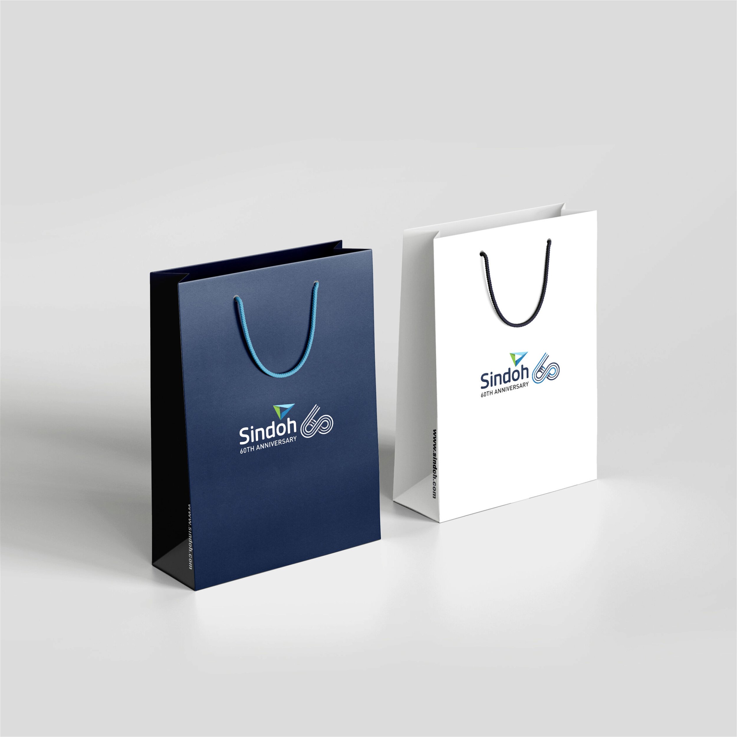
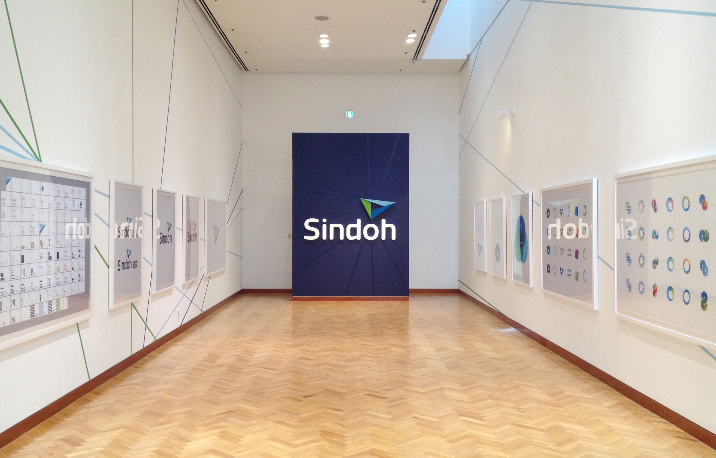
tangerine is now a strategic design partner to Sindoh, leading design seminars, and helping Sindoh grow through new products and exhibitions at their headquarters in Seoul, most recently to celebrate 60 illustrious years of Sindoh.
Tangerine have become like family to us. Martin clearly explains his thoughts behind design concepts and at the same time considers the position of Sindoh. When adjustments based on our staff feedback were needed, he came up with the best solution without breaking the entire concept. I have come to trust his philosophy.
Chairman and CEO at Sindoh
Creative Leap
10+ year
Strategic partnership
