Creating a brand beacon from the roadside
After 80 years operating in the oil and gas sector, CEPSA, Spain’s fourth largest industrial group, has become a major player in the Global energy market. Yet, even as the company’s products and services have swelled, it is their petrol stations that remain the crucial touch-point that connects the brand with society. In 2014 CEPSA looked to revitalise its service orientated spaces and empower the brand by commissioning the design of its flagship service stations.
Services
- Vision setting
- Product & spatial design
- Brand experience
- User experience & UI
Learning
A design team formed of three partner agencies, Saffron, tangerine and Malka & Portús came together to provide a powerful collaboration between brand, product and service design, and architecture.
A guiding brand concept called “Adaptable engineering” grew out of an inward look at the company’s values and technical strengths and an outward look at how CEPSA could differentiate itself from its competitors and other global brands that also own the colour red as a core part of their identity.
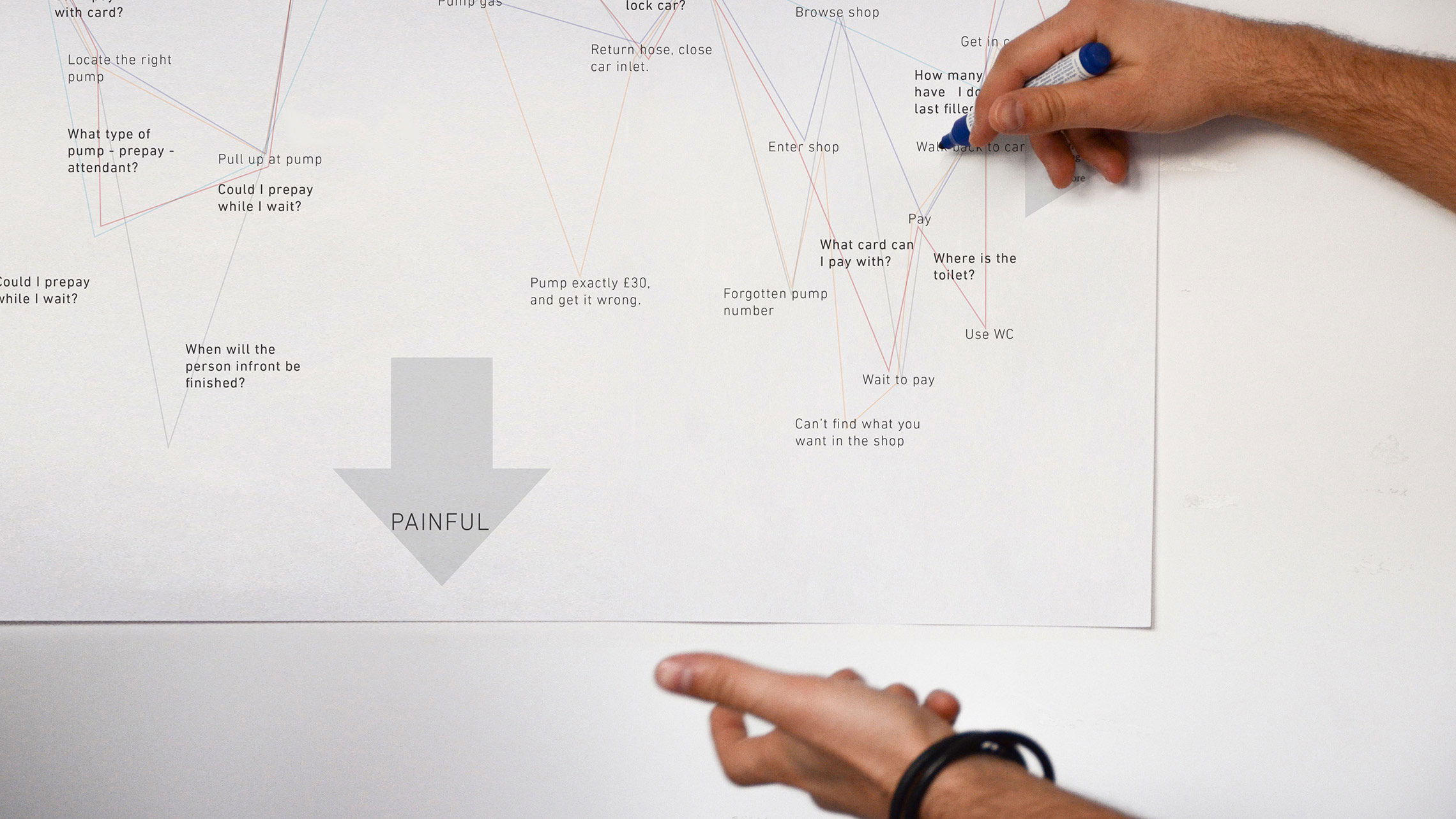
Visits to service stations were conducted to map the customer journey and identify pain points and opportunities for the customer experience and service design.
Leaping
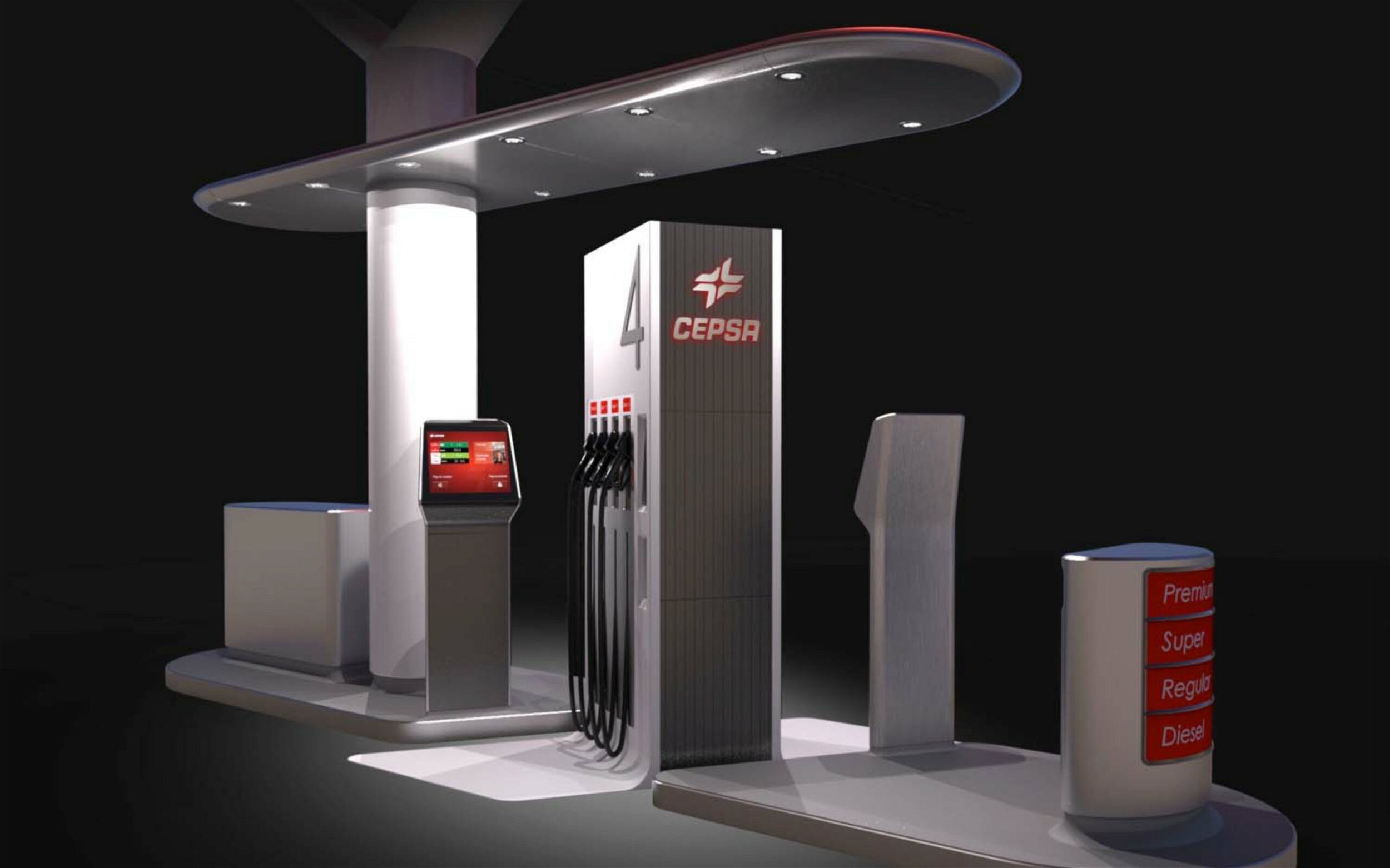
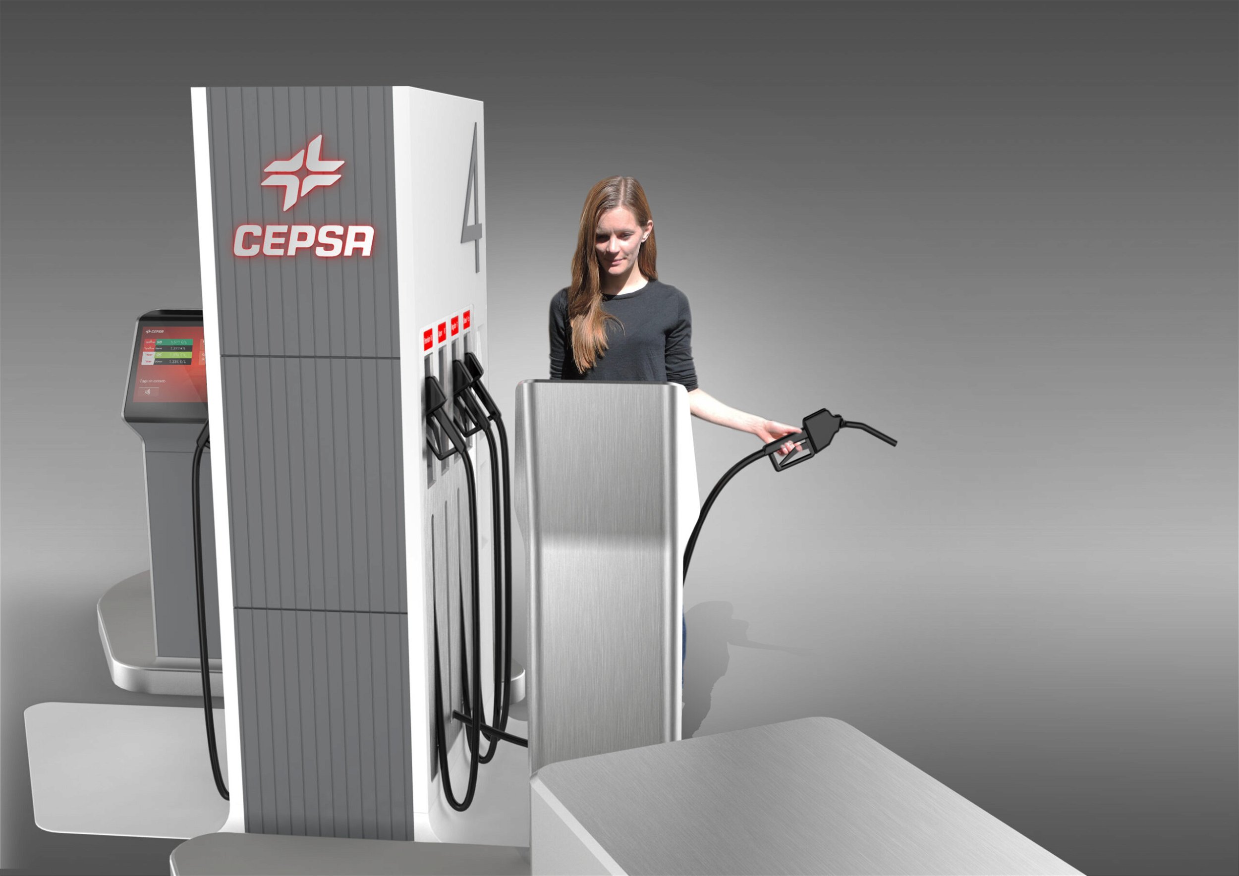
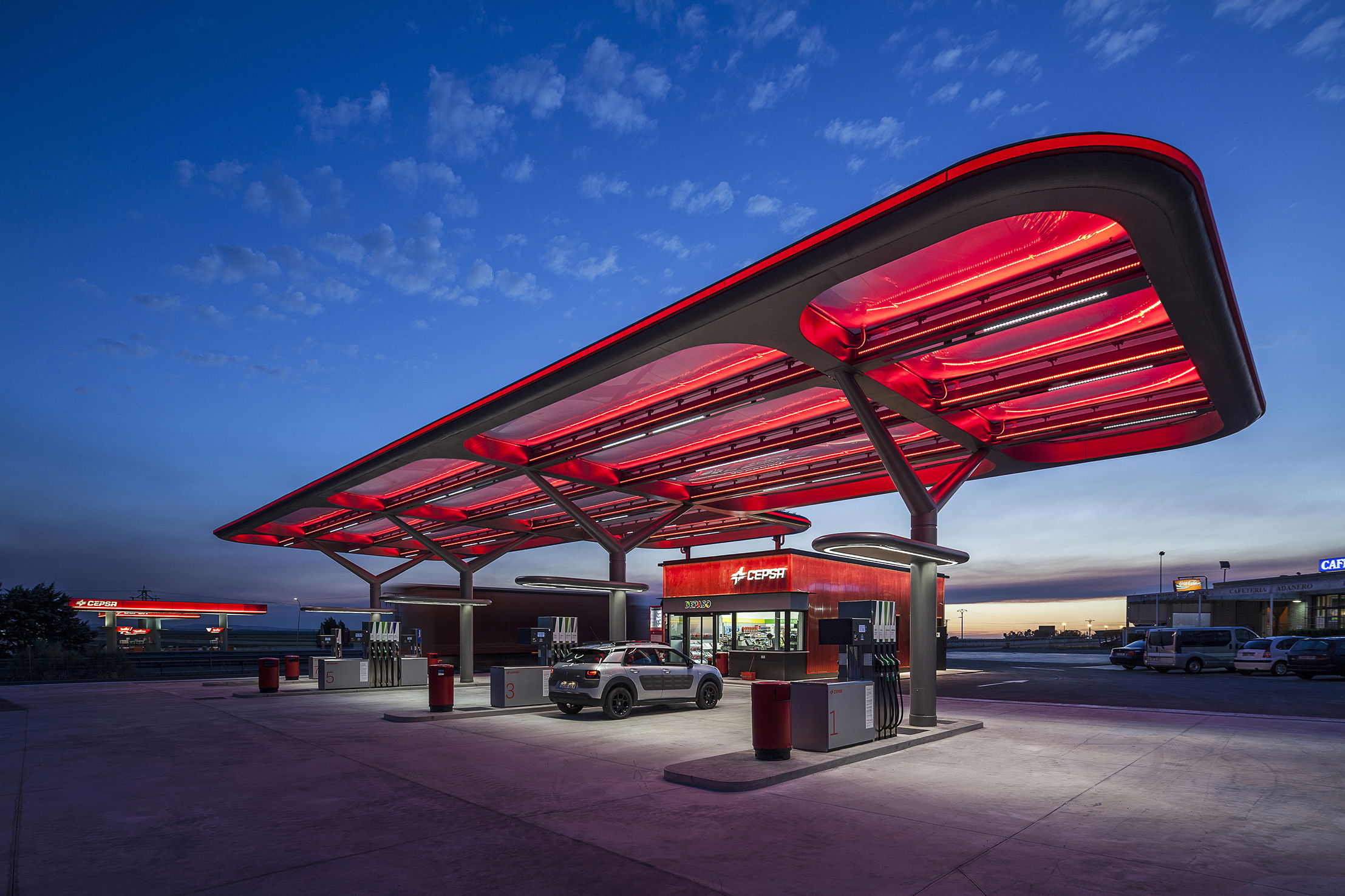
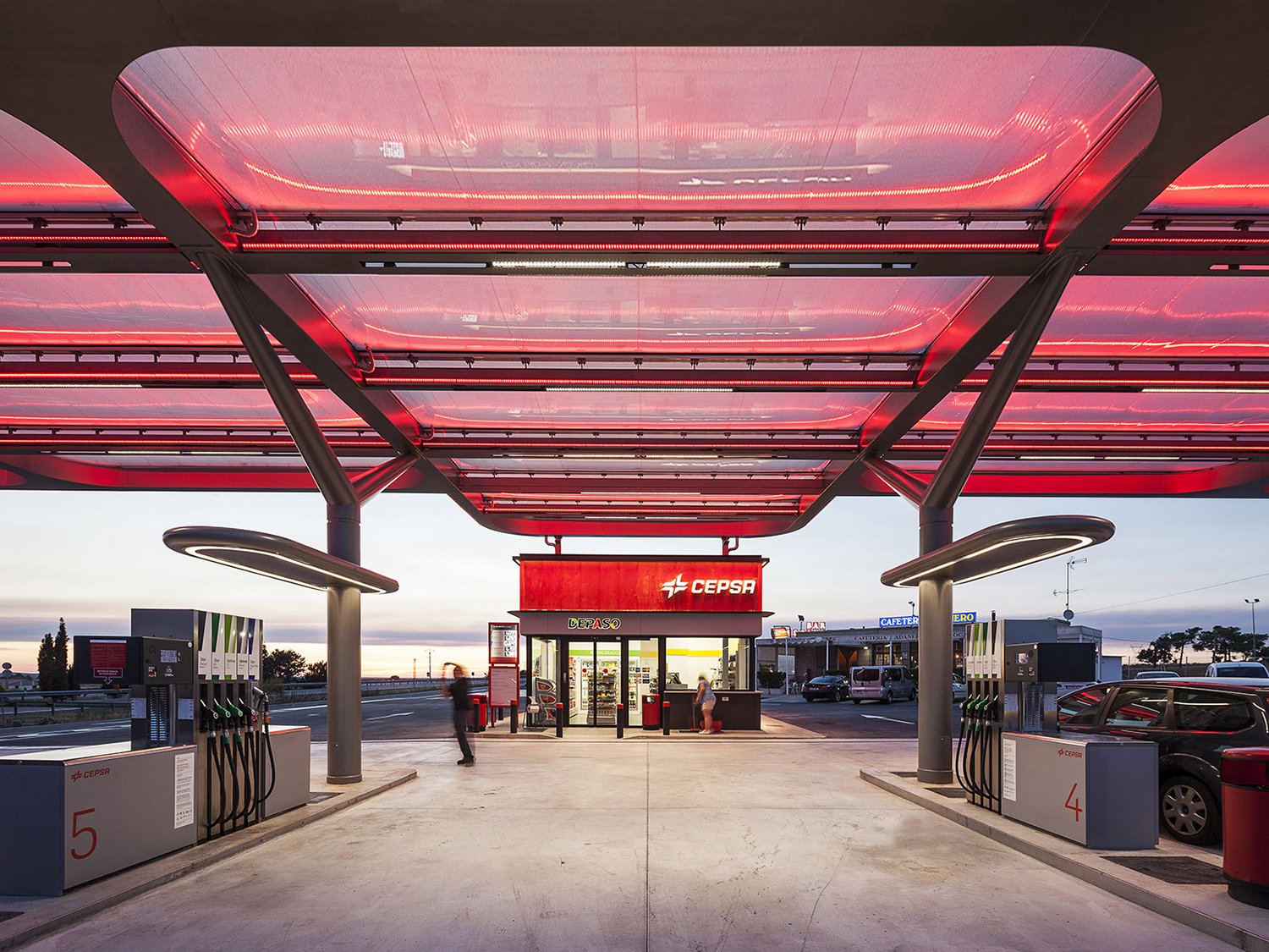
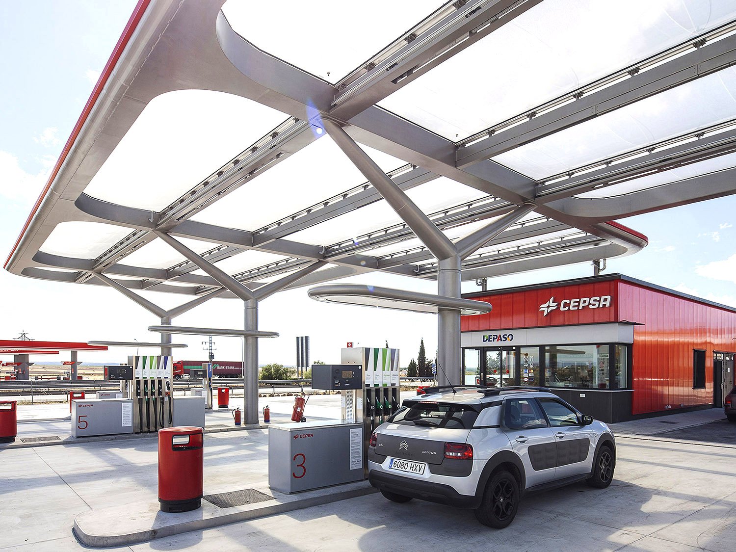
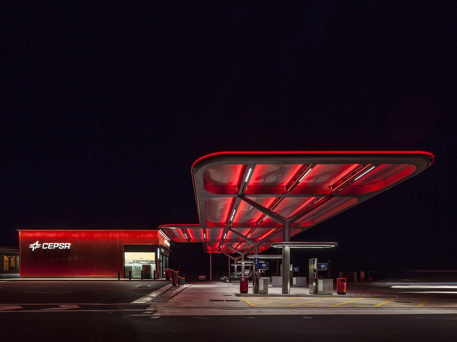
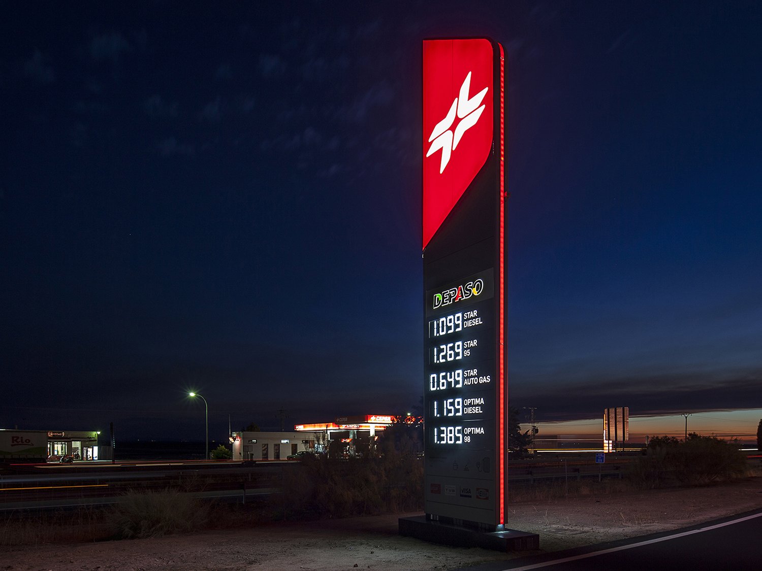
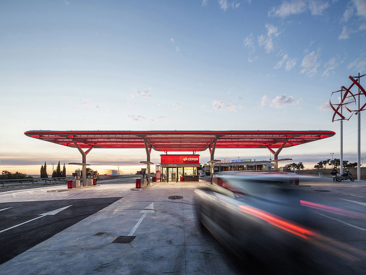
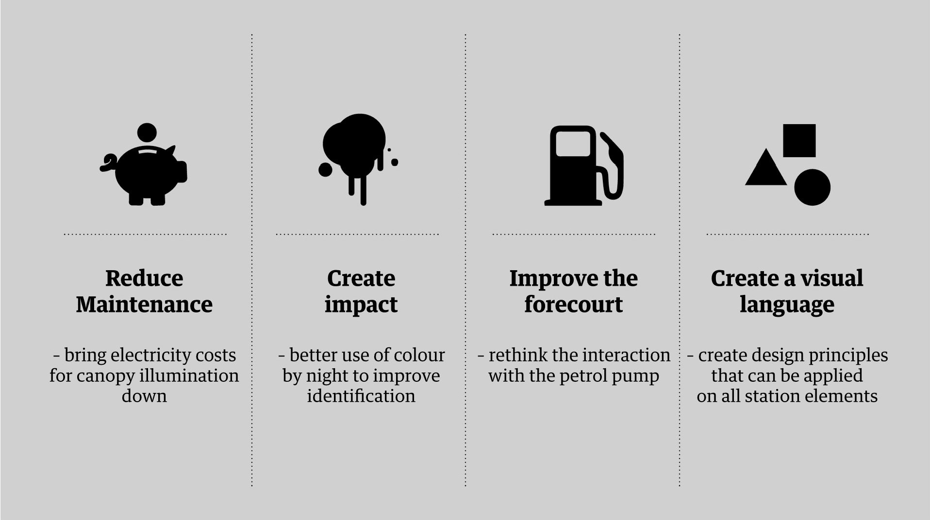
The challenge was how to create a powerful and distinctive visual language that could transform a regular petrol station from being a place to simply refuel, into a place to stop and rest. Bridging the disjuncture between the hardness of the road and the human needs of the travellers, the new design becomes a highlight to any journey. The team’s objectives were to create a visually compelling service station that represents CEPSA in a new and meaningful way, to find ways to elevate the customer experience using cutting edge design and the latest technologies to reduce maintenance costs.
Landing
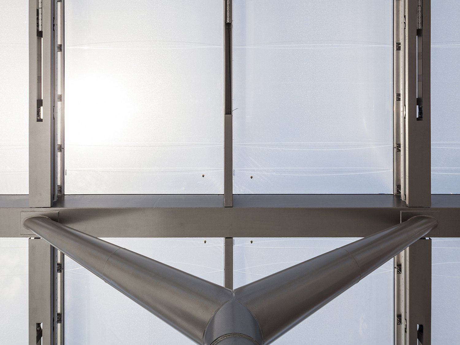
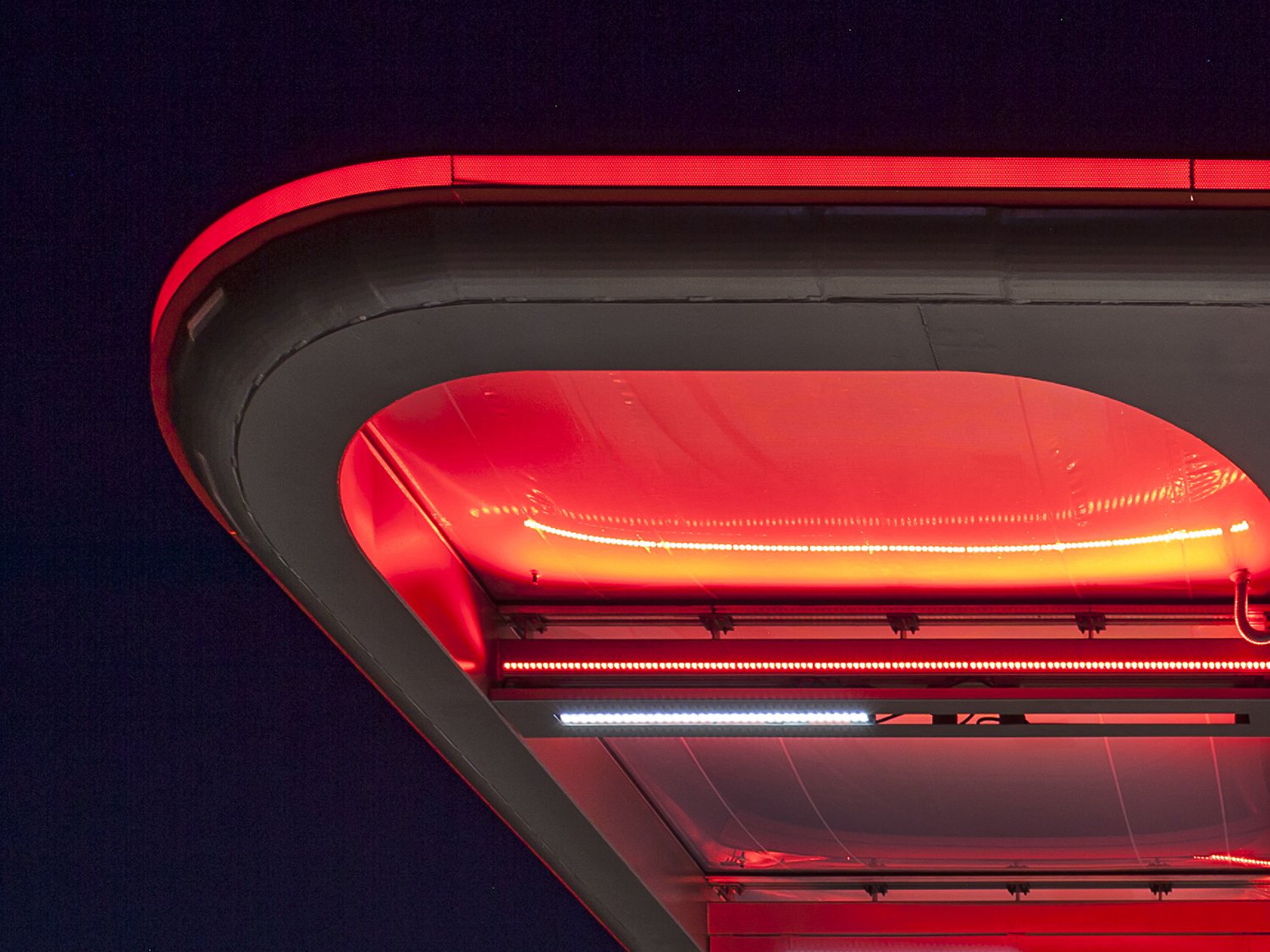
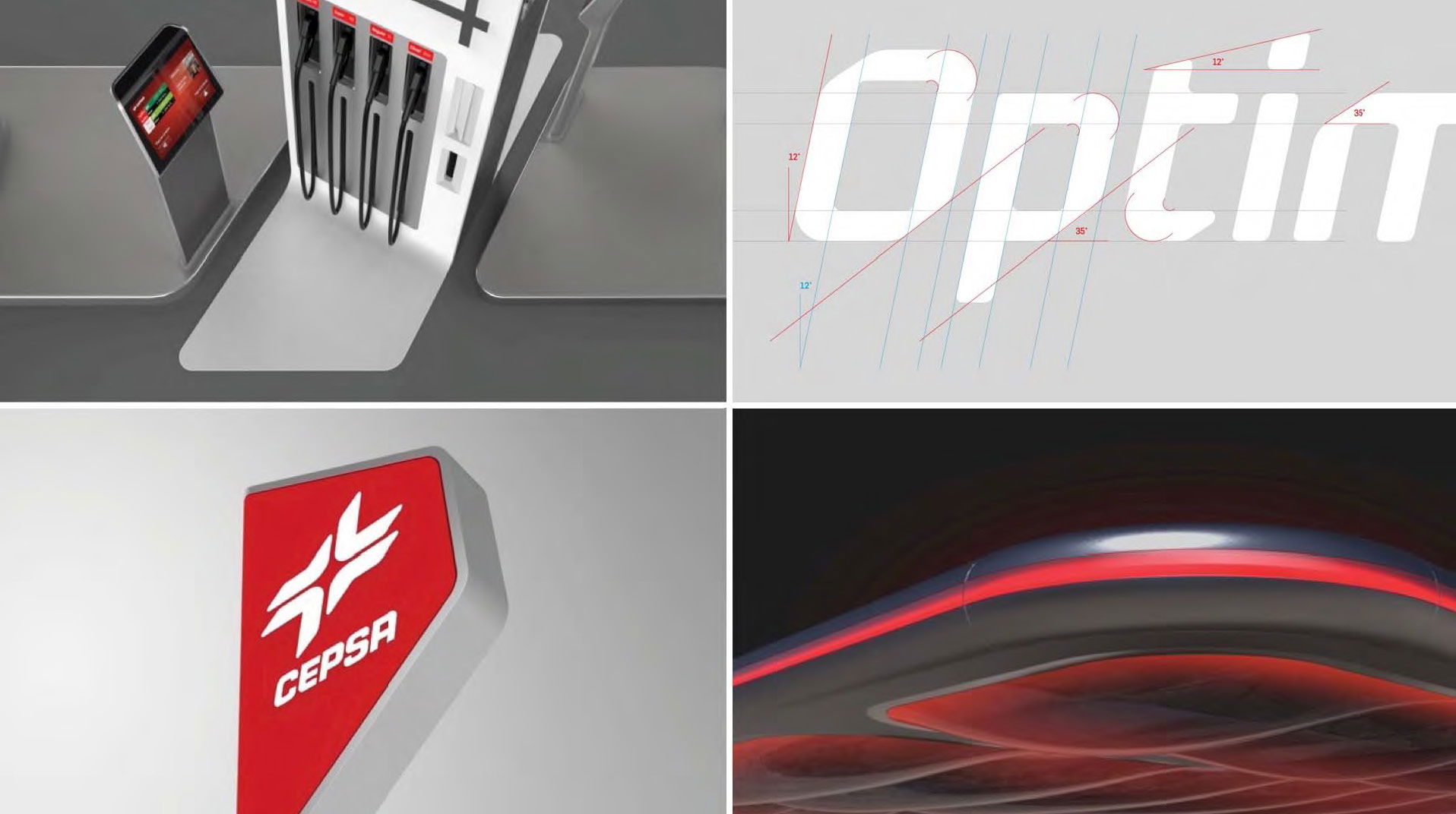
Every touch point of the station that the customer interacts with is closely considered; from the interaction at the pumps to the canopy, shop facade, lighting and signage. The forecourt is transformed into an iconic, airy canopy by day and a glowing red beacon by night, using a high-tech ETFE material that is self-cleaning, lightweight and recyclable. Its structure is assembled in a modular fashion that can be adapted to varied station formats and the ETFE’s 100% transparency minimises the need for artificial lighting thereby reducing running costs. Our future vision for the customer’s interaction with the refuelling island also proposed separating the display from the pump to provide a more intuitive and natural refuelling operation.